|
So I know I said my previous post would be the last until the New Year but the Homestyler App I use to create digital renderings for these blogs has a little Christmas Contest going on and while I don’t usually enter contests unless there’s prize money involved, I threw together a couple of quick entries I wanted to share with you as I think they’re super fun. Consider it a Christmas Bonus. So, what I chose to do was create two distinct Xmas decorating looks based on classic Xmas movies. What I wanted you to see here is the bigger picture of how Design can really be effective. Designers can use their skills to create a mood, a feel, a look for their Clients and take inspiration from anywhere. So, using Homestyler’s own room templates and items from their catalogue only, here are my two Classic Holiday Movie Inspired Rooms. It’s A Wonderful Room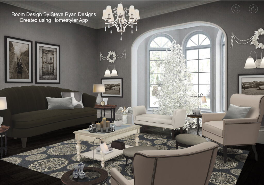 This living room is inspired by George Bailey’s house in the 1946 film “It’s A Wonderful Life”. While maintaining the architecture and furniture style of the 1940s I’ve been able to create a very traditional salon in a middle class American home. The other clever thing I did was choose items that were Achromatic - or I adjusted their brightness to be shaded - to make the room appear to be black and white like the movie. I did not need to use a black and white filter on this image at all. It was done through deliberate choices of colour and furniture pieces. It’s a great example of how Designers use Colour Theory in their work. The Best Little Who-House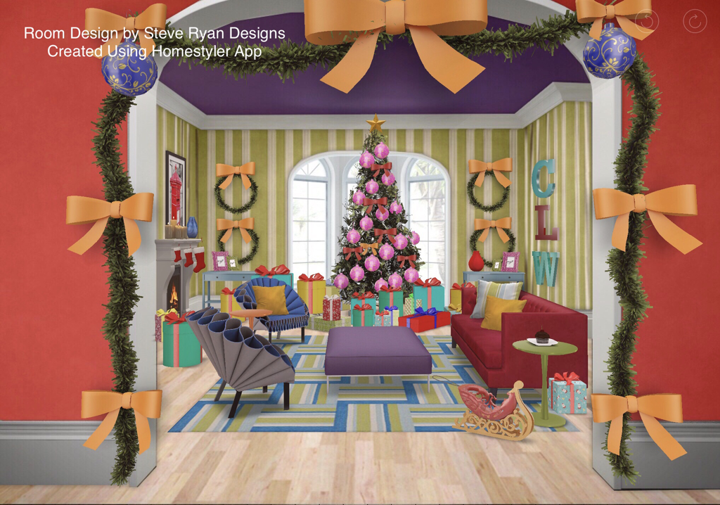 My second look is a different view of the same room but this time inspired by Cindy Lou Who’s house in the 1966 animated movie “How The Grinch Stole Christmas”. While still following the rules of good design (furniture layout, symmetry, scale & proportion), I’ve chosen to use the highly saturated primary and secondary colours on a grand scale that give the Movie its distinctive look. I’ve also worked in the over-the-top decorating and excessive presents for the Grinch to steal that feature in the movie. And again, everything here is from Homestyler’s own catalogue - even those weird blue chairs that look like coffee filters fit perfectly. This is a great example of how a Designer can use the full scope of their skills and training to create a Client’s space.
So this will definitely be my last blog post until the New Year. I hope you found it interesting and that it put you in a festive mood. I also hope it showed you the valuable services a Designer can provide. Happy Holidays Steve
5 Comments
With Christmas fast approaching we’re about to be covered in a blanket of white so I thought this post I’d chat about covering your interior in White as well. White is absolutely one of the most popular hues with Designers and Clients alike. I suspect this is because it’s an incredibly complex colour even though it’s not really a colour. What makes white so complex is it’s wide variety of undertones. Some are warm (having a yellowy browny undertone) and some are cool (having a bluey grey-y undertone). There are also whites that have a hint of a colour in them that is basically a very tinted version of that colour and is warm or cool depending on that colour. Decorating with white means having to mix warm whites and cool whites. If you do all warm, it looks like a dirty white and if you use all cool, it looks really cold. A good way to do all White is a “Cookies&Cream” approach. This is where you mix cool white walls, furniture and chrome metallics with dark chocolate woods in your floors and case goods (see my earlier blog post “The Neutral Zone” for more). But what if you want ALL WHITE? Like a Nordic paradise or Superman’s Fortress of Solitude? Well this means you need to mix warm and cool whites to balance it all out. Like this: 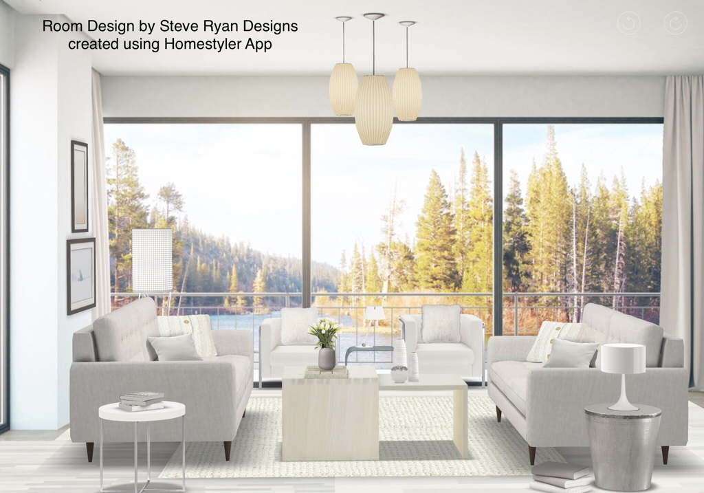 Here you can see an all white Interior mixing warm and cool whites. The walls have a cool blue undertone. The floors are a yellow undertone. Then I’ve mixed them throughout the soft furniture, accessories and case goods. The other way to add visual interest is by layering textures. You can see some tables are a lacquered finish, some show wood grain. The rug has a plush pile. The throw pillows are faux fur, linen and knitted. Even the sofa has button tufting and the floor lamp shade is textured. These all combine to make a great visually interesting look. A note about art: if you have a great view like this, keep your art simple and neutral because the view will be your art. If it’s less than stellar, consider using art dramatically to draw focus. If you choose the latter, be aware that if the art is coloured it will really stand out even if black and white. Be aware that you can use coloured art in an all white room if you like as it doesn’t necessarily have to be part of a room’s colour scheme
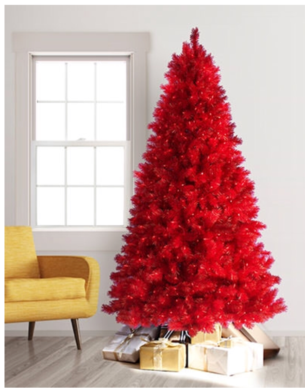
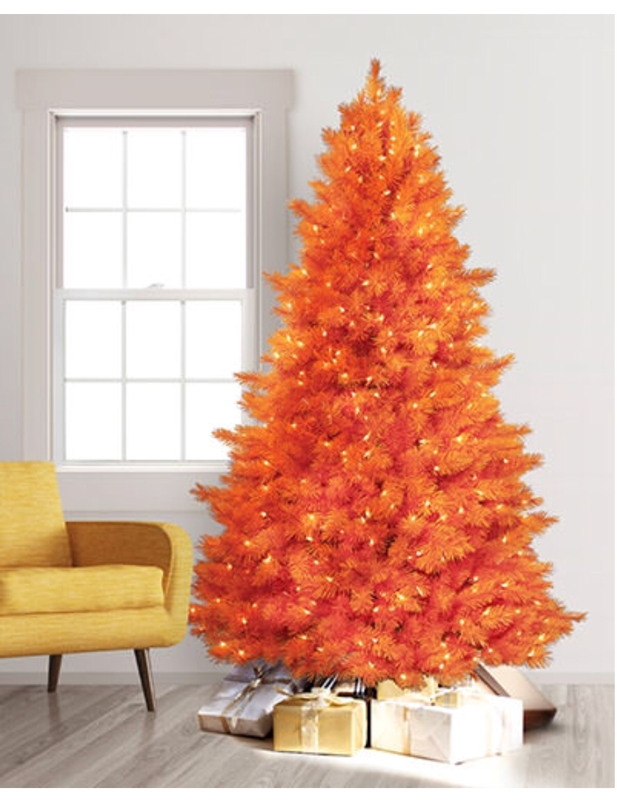
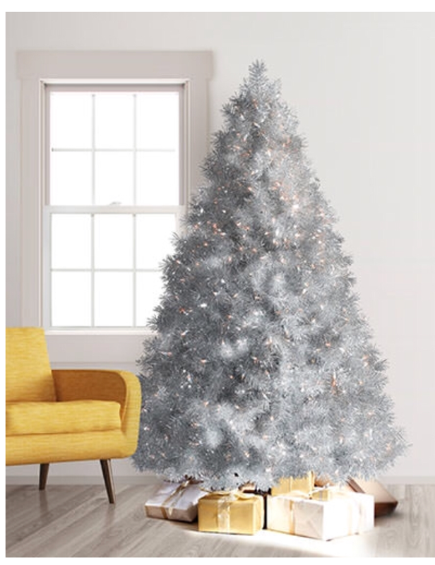
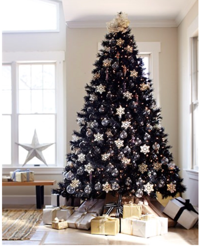
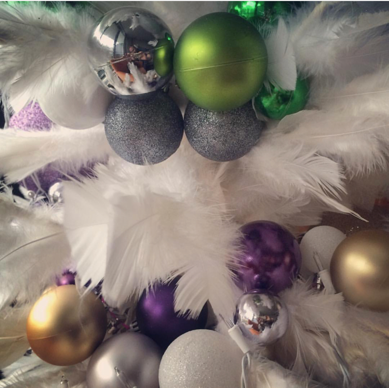
So there’s my advice if you want to create an all white interior. Of course, you can always hire a Designer to handle a room like this if it seems too daunting. We’re always here for you. Also, this is my final blog post for 2018 as I’ll be taking a couple of weeks for the Xmas holidays to spend with my family. Starting in 2019 I will likely only be doing a post bi-weekly or possibly once a month. I may be booking a new client with a time sensitive project I hope to land and make great and I’ve agreed to volunteer to help out with the Decorators & Designers Association of Canada’s (of which I am a proud member) annual awards gala in the Spring and there is some other volunteer work I’d like to start doing in the Toronto community. All of that will take up some of my time but it’s all part of The Well Designed Life I’ve created for myself and want for my Clients and everyone. Until 2019, have a great Holiday Season and thanks for reading Steve As the Holidays approach, everything becomes blanketed in lights and glitter. As a Designer this time of year fills me with delight - and dread - because while some people put up festive decorations, some people get so carried away they go full on tacky (I’m talking to you woman across the street from me who puts a up a full size tree in her studio apartment mid November and leaves it up until Easter!!). So this post I thought I’d give you three tips for amazing holiday decorating. 1) TREES If you’re going to put up a tree, why not consider doing something a little more interesting? Like COLOUR!! Consider getting a coloured tree like these ones from treetopia.com. They come in a rainbow of hues and neutrals that can really add some unconventional wow to your decor. What’s great about these is that their colour is part of the decoration so you can actually use less ornaments. Also if your interior is pretty neutral, you can get a real punch of colour. If you prefer a really sophisticated look go with white, silver or black! 2) Decorations Try and keep your ornaments to one simple colour theme like red/gold/green or silver/gold/white especially if you like to put up a lot of decorations. Having a lot of different coloured balls, ornaments and general seasonal items on your tree, mantle, bannister, chandelier, in bowls on the coffee table, etc can look really chaotic. If they are all part of the same colour family (1-3 colours is best) the eye will actually group them and will look more harmonious and unified. If you hate hanging countless balls in your tree, make a garland out of them using thin ribbon or fishing wire. Simply knot a large ornament, slide the others down in various sizes and knot the final one. Then you can just wrap it around the tree. It’s waaaay faster and looks great: 3) Outdoor Decorating This is the one that really turns neighbours into the Hatfields and the McCoys. If you love the Holidays well that’s great but don’t get so involved you lower the property value of your ‘hood. Case In Point - this actual House in my area:  That is the kind of house a child eating clown would live in. This does not say ‘Happy Holidays’. It says ‘Come get your balloon, Georgie’. Yeeeesh. I suggest keeping it simple: outdoor LED lights in white. They’re clean, reflect beautifully off snow cover and actually help light your walkway, front steps, porch making it safer on potentially slippery surfaces. Draw a welcoming focus to your door with a wreath and a nice urn with some greenery, ornaments and lights. And lose the strings of lights going around your rooftops and windows, etc. They’re a pain in the neck to put up and take down. If you really want a big light show that’s way easier you can buy a light with a gobo screen you plug in and set on your front lawn that will project moving lights onto the front of your house in variety of things like snowflakes, stars etc. And, in the name of all that is holy, do not put one of those giant inflatable Santas or Frostys on the front lawn. If you don’t keep them running 24/7 there’ll be a dead, deflated Xmas icon in front of your house traumatizing children and carollers alike:  That doesn’t exactly scream ‘Christmas Spirit’, now does it???
So I hope this has given you some ideas for a Well Designed Holiday and remember, if the season is getting a bit overwhelming for you in “A Bad Moms Christmas” kinda way, you can always hire a Designer to decorate your house for you. We’re always here to help so don’t hesitate to reach out to us. Thanks for reading. Steve Of all the colours, I have to say that Pink is one of most polarizing and unfairly so. There is no pink on the Colour Wheel. It is simply red that’s been tinted with white. What’s weird is, if you mix blue and white you get light blue. If you mix yellow and white, you get light yellow. But add white to red and you get this totally separate entity that Western culture has attached a butt load of gender stereotypes to (and slapped on the packaging to every female product in Shoppers). Pink is seen as girly (not just feminine or softer - female AND under the age of ten) but it’s really all just in our heads. So I thought this post I’d make like lover-of-pink Taylor Swift and show you how to shake it off by designing a room using PINK without the end result looking feminine or juvenile. Let’s take a look: 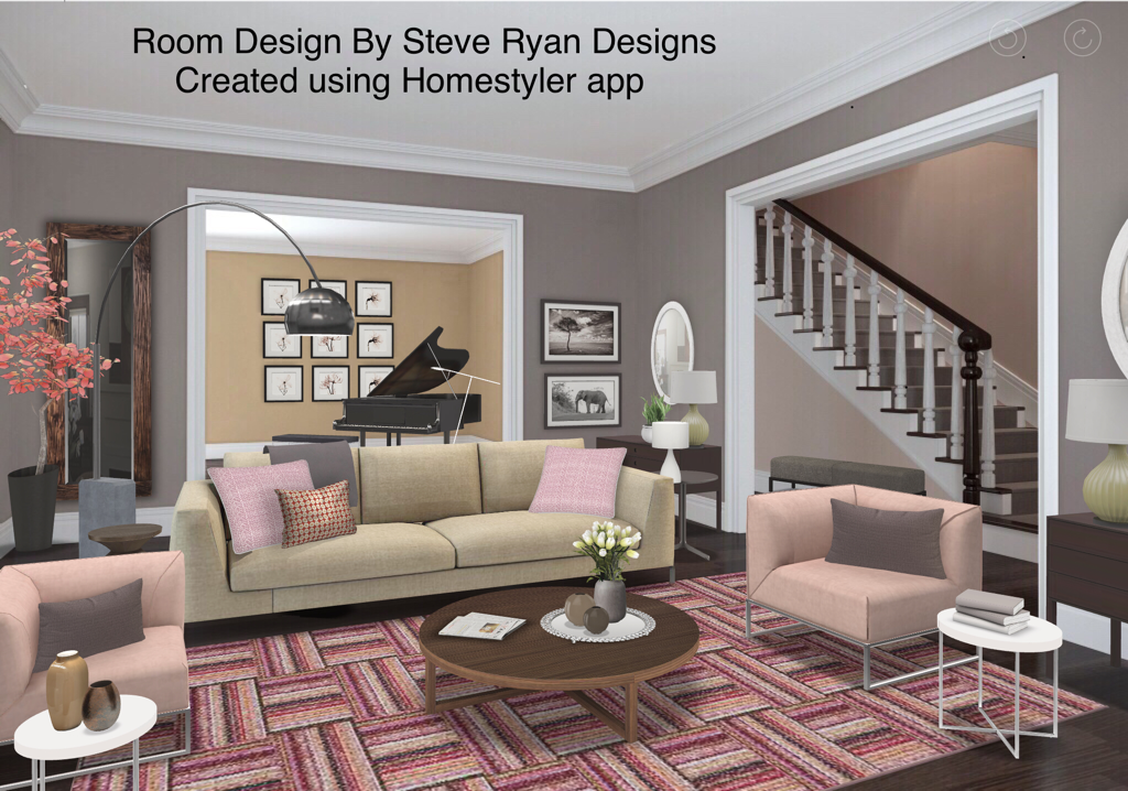 Here’s a Living Room in a house where I’ve used pink as the main colour. I think the best way to combat the feminine stereotype is to balance it with Neutrals like crisp white, tan and grey. These are great balances because the grey and white are cool tones for the warm pinks. Tan and pink also look great because tan is tinted brown (derived from orange) so you basically have red and orange which is an analogous colour scheme). Tan&Pink will be warmer together so definitely use some cool whites to cool it down. The other way I’ve balanced the feminine feel here is using straight lines and 45 degree angles against the soft feel of pink. This means the furniture is clean lined, square armed, the mouldings are also very squared. Even the rug pattern has these harder angles. Using Neutrals balance the pink and the hard corners cut down on the softness you’d feel on furniture with rounded edges and arms. Also I’ve kept the pinks here very pale. A more saturated bubble gum pink might be a bit harder to deal with but this light pink is easy to handle. Furthermore, the furniture is modern and clean lined with lots of leg showing. This is also a bit more masculine in feel to counter the preconceived notions of femininity around pink. If the furniture was skirted or slip covered, it would feel more feminine and mixed with pink would definitely come across as girly. I’ve also kept the patterns cleaner: solids, stripes, geometric, overall patterns (you’ll remember reading about those in my recent blog on Bachelor Pads) and kept away from florals and damasks. Let’s look at pink on a larger scale. 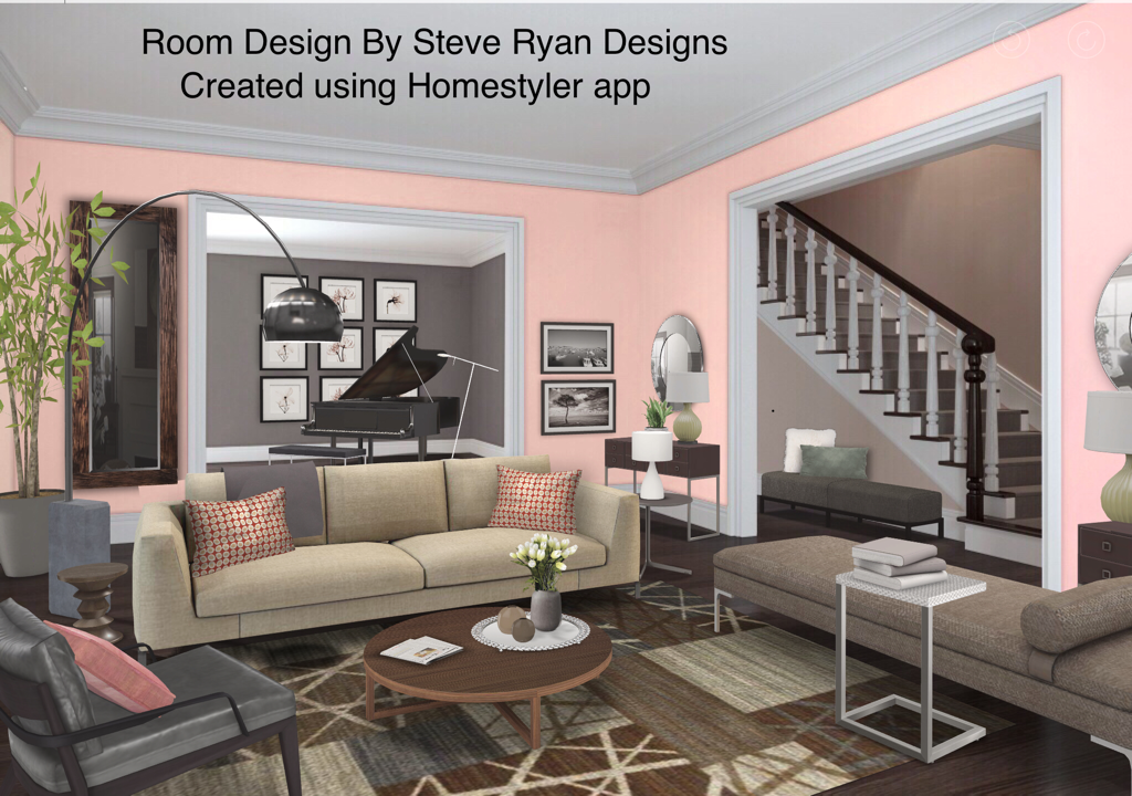 Here we’ve used a very soft pink on the walls and a few small accessories. We’ve kept the furniture Neutral again with clean, straight lines and added some grey leather in the armchair to balance out the pink. But because there’s so much pink on the walls, I’ve kept it to a minimum elsewhere since having it on such a large scale can get very overpowering if it’s not used in smaller doses elsewhere. I also recommend going with a soft blush pink if you’re planning on using it on the walls. Going with something more saturated can feel like you’re living in a bubblegum factory. Nobody wants that.
I think both of these looks are very liveable. They’re clean and modern but not the least bit juvenile. They’ll especially look great at night when the lighting levels are lower too. So don’t be afraid to Think Pink. And remember, if this is something you’re thinking of doing but are nervous, you can always contact us to help. Until next time, thanks for striving to live the Well Designed Life. Steve |


 RSS Feed