|
One of the issues in Design and Decorating I hear about a lot from people is that they don’t know where to start. They may have an idea of what they want from a room but they can’t figure out how to get there or pull it together. This is the Creative Process. It’s a weird, organic thing that kinda springs from within that can seem foreign to the average person but Designers get really comfortable with the uncomfortableness of it. So this post I thought I’d take you through how I start a decorating a room all the way to the final product for a traditional looking living room. The Starting PointFor this living room project, we’re going to use a wall colour as our starting point. Your starting point can be anything. A fabric you love. A sofa you just had to have. The trophy home Diane Keaton lives in in every movie. Paint is often a good place to start if you like colour and want to use it. For this, we’ll use Sherwin Williams Colour of the Month for June, “Cerebral”: 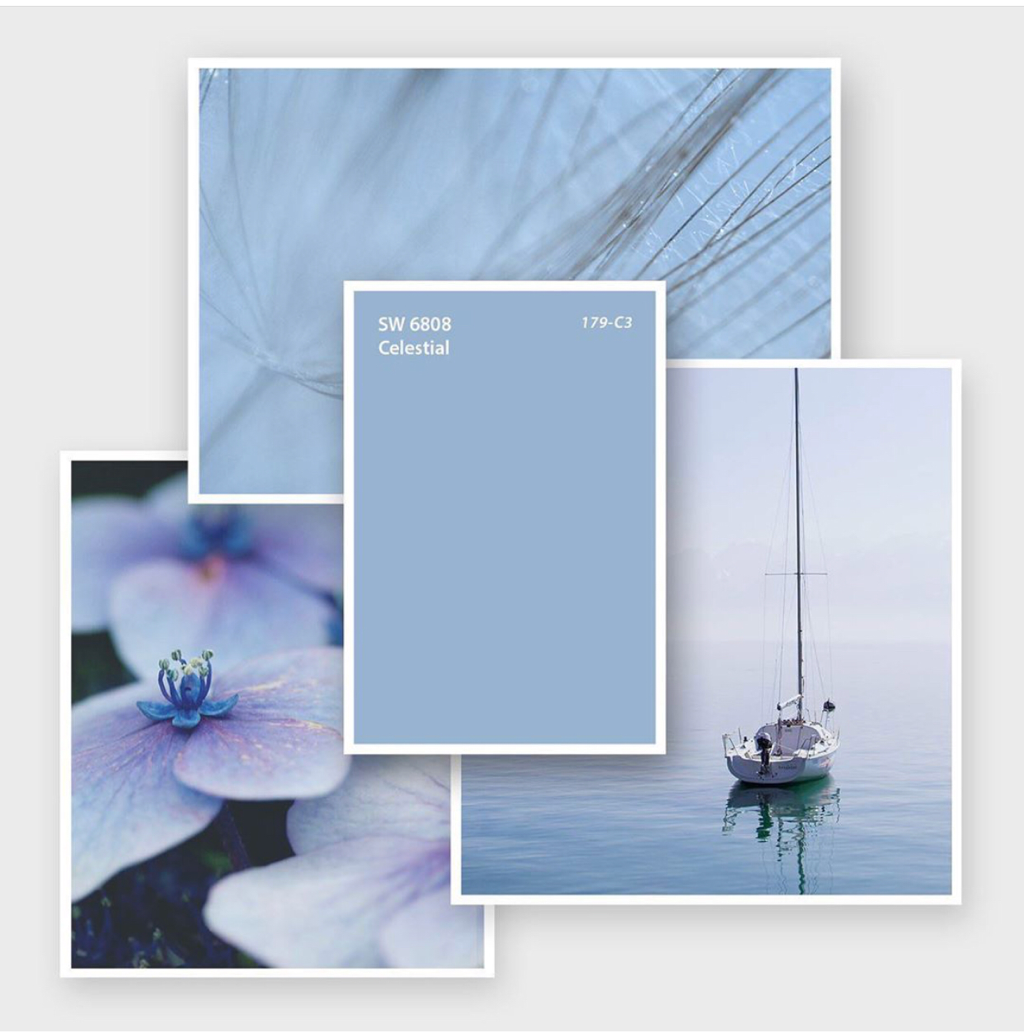 Cerebral is a very calming, soft French Blue. Since I’ve decided this room will be traditional in style, I start by thinking what traditional things I might equate with this colour. When I look at this colour, it reminds me of the Wedgewood China my Mother collects. This is good because Wedgewood China is also traditional so that will become my inspiration for our room. The Inspiration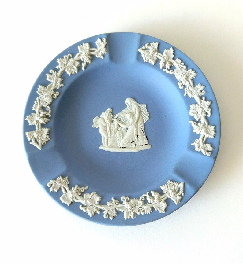 So here’s a piece of Wedgewood to give you an idea of what’s inspring me. I know I’ll use the blue on the walls and I’ll incorporate white to mimic the crisp feeling it has. The China isn’t overly ornate so I’ll keep the room a similarly clean space. I know I’ll be using traditional furniture and I’ll be sure to use lots of curved and round items to relate back to the curves of this ashtray and I’ll look to incorporate some kind of floral or curvy patterns somewhere to nod to the patterns on the piece. Then I start selecting the pieces and items I think will work. Once I’ve selected my furniture and other items, I’ll collect images of them with fabric and paint samples into a collage to see how they work together (using a collage app makes it easy). I add, remove or replace items until I get a collection that evokes a room that “feels” like my inspiration. There’s no linear way to this point and I can’t quite explain it, but it just kind of develops. I just keep thinking about my inspiration and what I’m trying to achieve with the room and it happens. I often use the analogy of a rehearsal. In rehearsal you try the set elements in different ways, keeping what’s working and throwing out what isn’t until you reach what you’re trying to say overall. It’s that same fearlessness/willing to fail/eye on the prize combination that performers use in rehearsal that gets you your greatest reward. The Final Room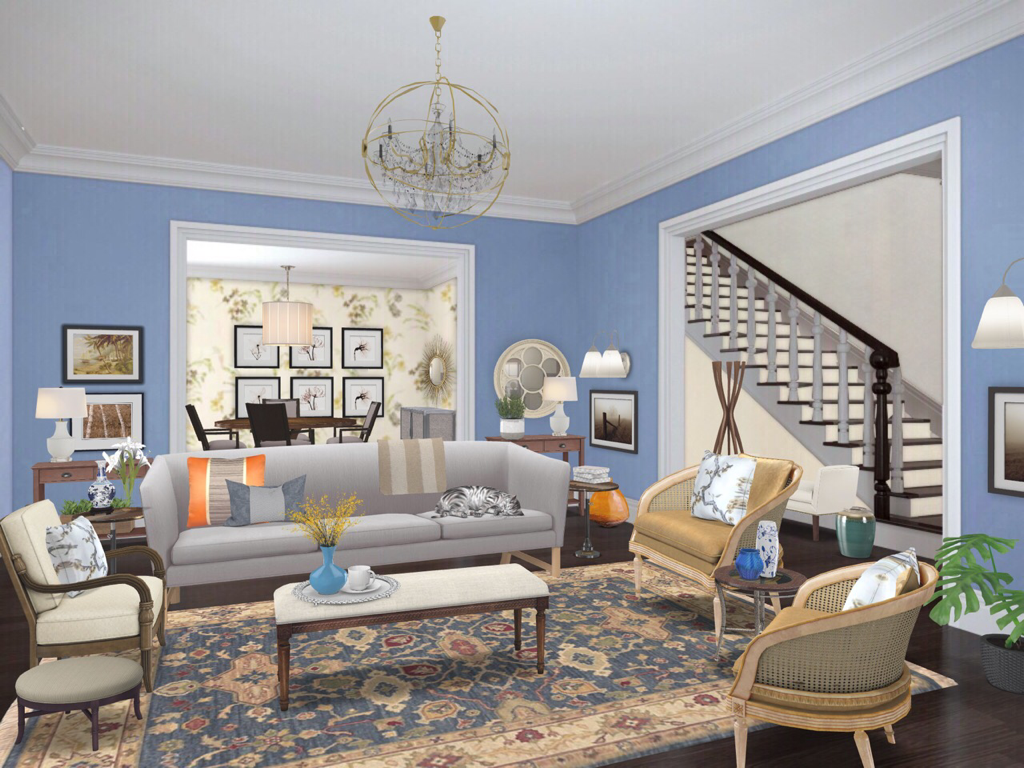 And here we are. You can see I’ve used our Celestial paint on the walls with white trims and ceilings like our Wedgewood inspiration piece. I’ve used patterns in the rug reminiscent of the detailing on the inspiration piece. The furniture is traditional (tighter, feminine, more leg, curvy, caning, etc) to fit in with our goal of a traditional looking space. I literally sourced out items and combined them until I got just the right fit. That was the Creative Process at work.
I hope this gives you some confidence in finding you way through the Creative Process. It can feel like a bit of a mine field but it’s really not that scary as long as you pay attention to where you’re stepping. Until next time, thanks for reading and striving to live The Well Designed Life. Steve
4 Comments
Yes. It’s a real thing. National Painting Week runs the first week of June. I’m not sure why, but I suspect it’s generally consistently warm and sunny enough that you can do your outdoor painting and have windows open for your indoor painting. Makes sense. Anyhoooo, todays blog post is about the magic of paint. Not only does it hide a variety of sins and can unify cabinetry but it is absolutely the cheapest Decorating tool that gives the most dramatic change. Plus you can paint so many things. Walls, floors, ceilings, cabinets, furniture, picture frames, metal, glass. As long as you prep your surfaces properly, your decorating potential is unlimited. However for this post we’ll look at how painting walls can dramatically change the same room and hopefully give you guidance so you can choose your wall colours with confidence. The Neutral Room So this is our neutral Living Room starting point . I’ve used a very harmonious palette of beiges, greys, browns and whites. You can see that this is very calming and very easy to live in but kinda blah. Because it’s Neutral we can add any colour and create a totally different look. For this entire post, I will only be changing the room colour. All furniture and accessories will remain the same. So let’s do it. Colour on the Ceiling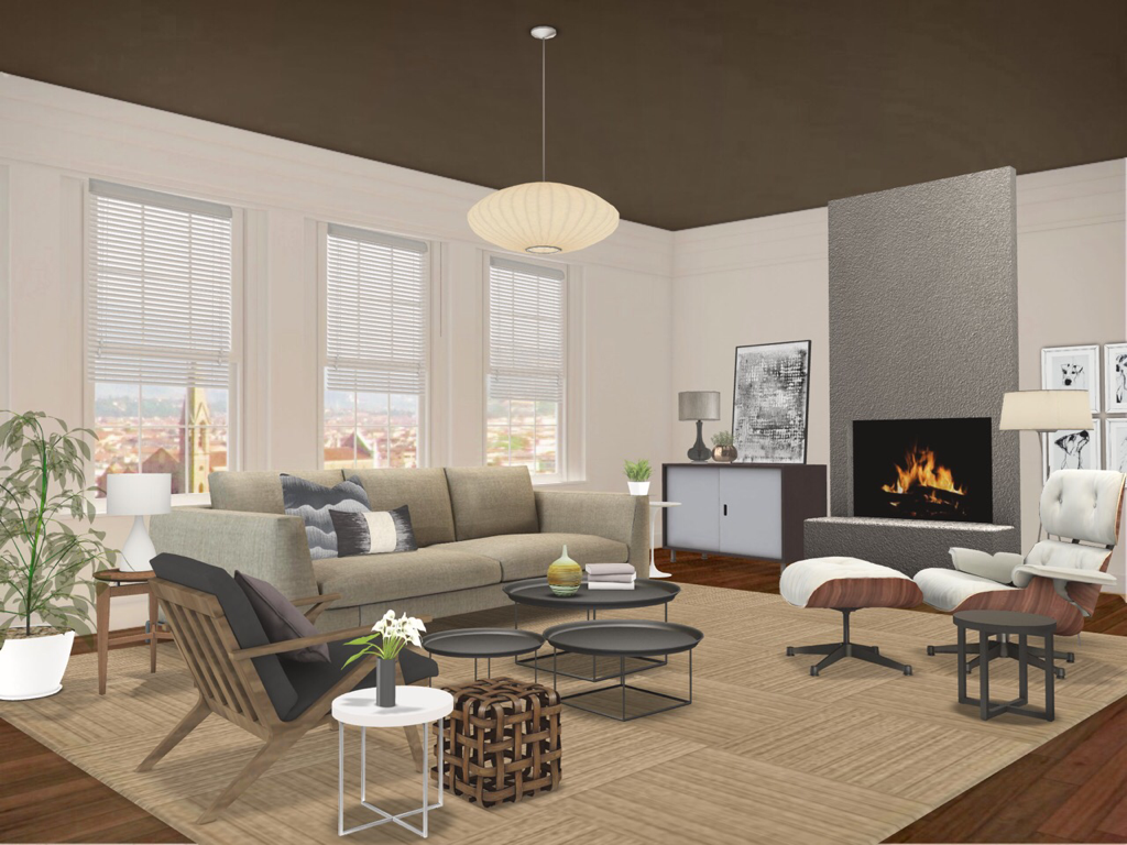 Here we’ve simply painted the ceiling (also called “The Fifth Wall”) a dark colour to add some drama. Ceilings are a pain to paint but you can see how throwing a colour up there has a great effect and because it’s above the sight line it’s less intrusive. Note that ceilings get about 30% less light so they will appear darker once finished so choose your hue carefully. If you’re skittish about painting something, consider the ceiling. Dark and Moody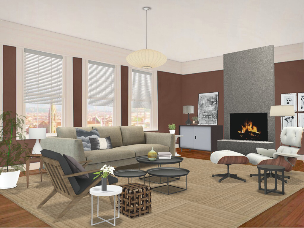 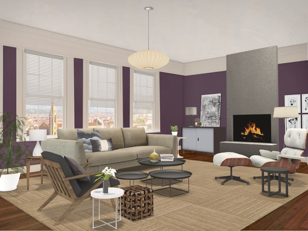 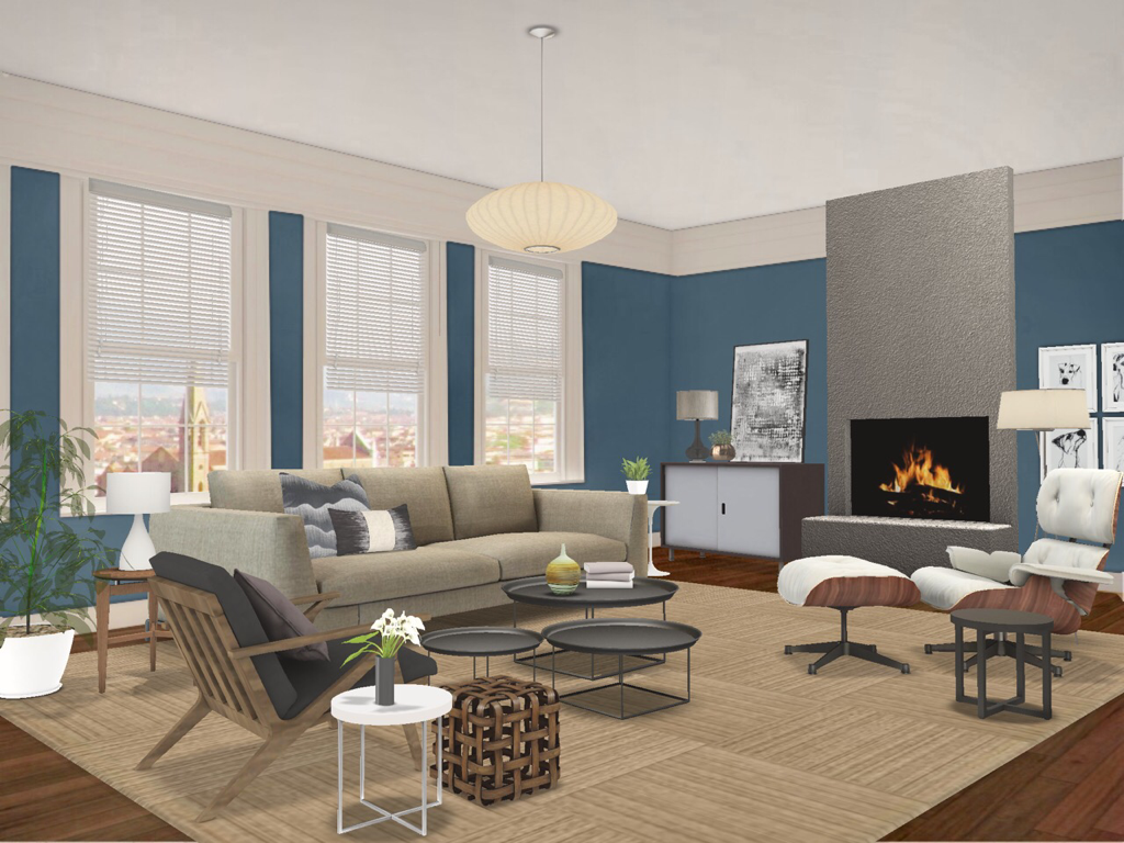 So here we’ve used dark colours on the walls. A lot of people think painting a room a dark colour will make it look smaller but actually the walls appear to recede. You can see how the brown is still harmonious like our first image and how the deep purple and blue have a bit more oomph while maintaining that coziness. This is definitely dramatic and using darker colours affects how light plays in your space. Your furniture and accessories will appear more sumptuous. If you want a room to feel cocoon-like, this is for you. Fresh and Natural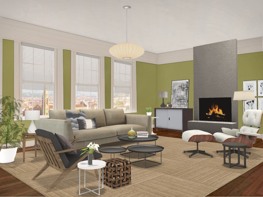 So here we’ve used a deep yellow green on the walls. Green falls right in the middle of the colour wheel so they’re neither warm or cold. But when mixed with these neutral colours, especially the browns, you get a very earthy palette that’s fresh and still calming like our first image. It has a really peaceful feeling to it. If you’re a nature lover, consider using greens. Bright and Vibrant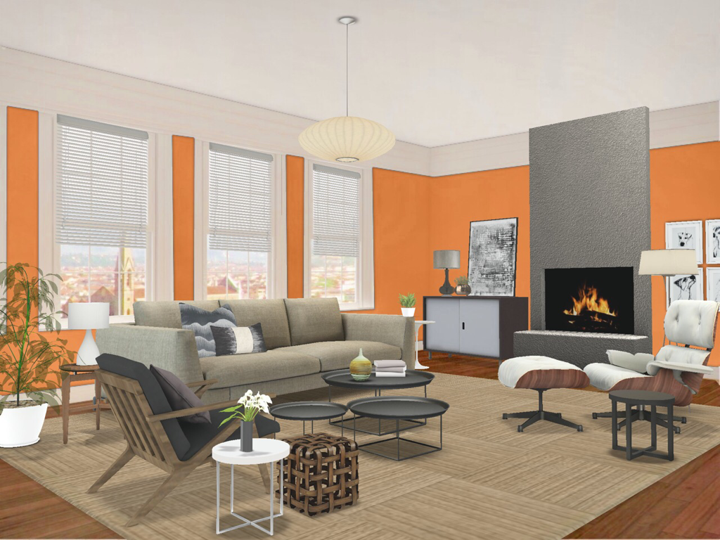 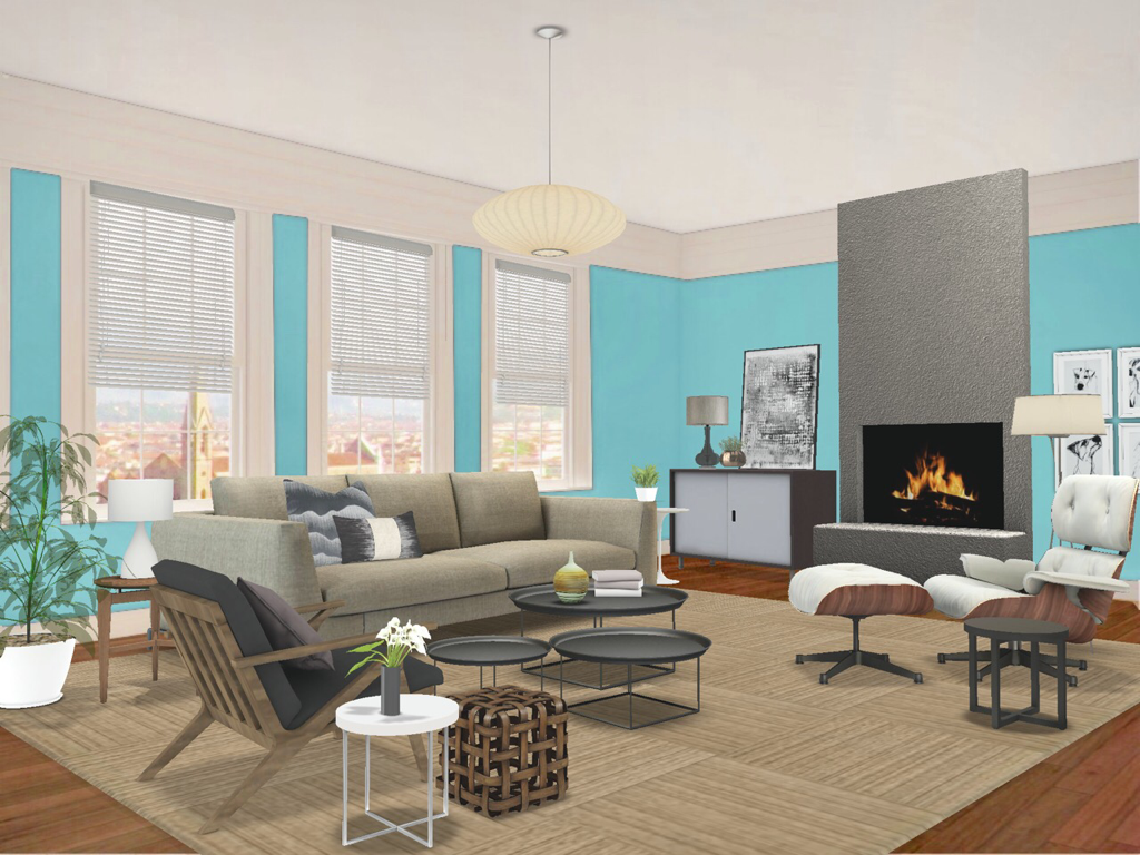 Here we’ve used brighter, more vibrant colour on our walls. Using the spicy orange gives the room real punch but it isn’t over the top because there’s so much brown in the room. Brown is a broken hue derived from orange so this technically is a monochromatic colour scheme. Blue is the opposite of orange so it works great with browns because it’s basically a Complementary Colour Scheme. Thus, it has a little more zing because it’s playing off the browns. What you will see here is how the rooms look brighter than all the previous because of how light plays off the vibrancy of these shades. Be Brave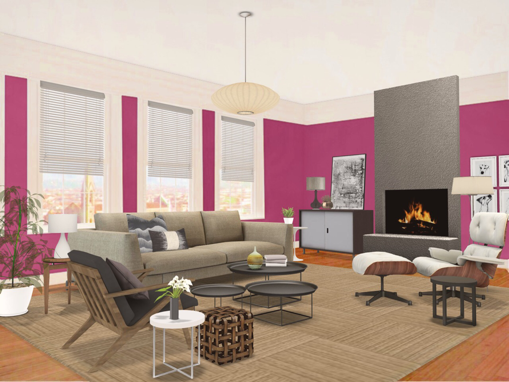 Ok. I get this isn’t for everyone. But what I wanted to show you here is that you shouldn’t be afraid to try. If you love fuschia or any bold colour then use it. This room still totally works and I think if you love it then you can’t go wrong in your decorating. If you’re feeling less than brave, try painting a cheap side table or chair that colour. It’ll still give you all the feels that you get from that colour you love. Your home should reflect you.
So there you have it. You can see how a little paint can totally transform a room. I realize it can seem overwhelming. Designers actually do Consultations just for colour but try not to get flummoxed. It’s just paint. If you hate it, it’s cheap and easy to change and the staff at your local paint companies like Sherwin Williams or Benjamin Moore can give you advice on what products will give you the best result you’re looking for. So grab a brush and jump into National Painting Week. Until next time, thanks for reading and striving to live the Well Designed Life. Steve |
 RSS Feed