|
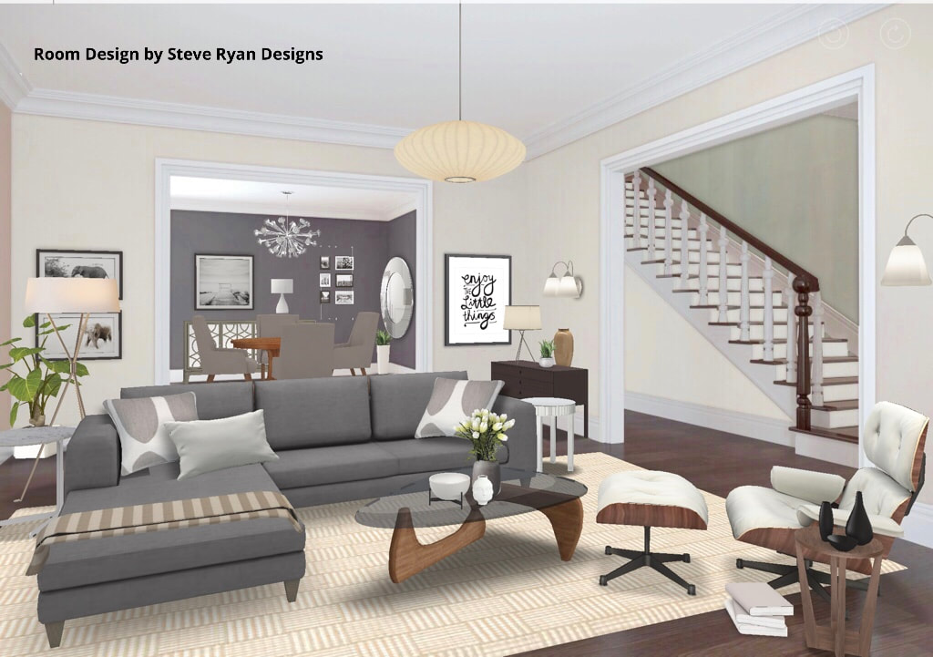
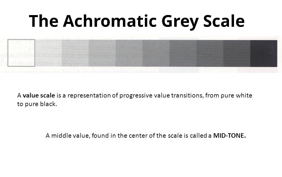
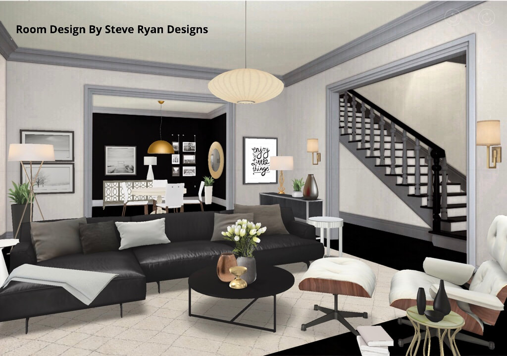
Hi Everyone! Since my last few posts have been about colour and how to use it, I thought this time I’d give you a lesson in working with Neutrals and the Achromatic Colour Scheme. Neutral interiors seem to be the favourite of sooooo many people. They fill the pages of every Design Porn magazine; some Designers have made entire careers out of using only them; I heard your collective woohooery when you read it’d be today’s subject. I think there are two reasons why people love neutral interiors. 1) they’re very calming and harmonious and 2) they’re hard to screw up. While the former is true, the latter is a little trickier. So I thought I’d do another of my oh-so-popular “One Room, Two Looks” showing the same space done in Neutrals and using the Achromatic Grey Scale. Never let it be said I don’t give my audience what they want. When working with Neutrals you’re not using any colour, only black, white, grey, brown, beige, tan, etcetera. What you need to understand is black, white, grey are “cool” colours and brown, beige, tan are “warm” colours. So when using them you want to have a balance of warm and cool because it’s not only more harmonious, our brain actually likes to see it. So here’s a Transitional Living/Dining Space to illustrate my point: Room Design Created Using HOMESTYLER AppHere you can see that I’ve balanced the grey walls and white trim with some beige walls and warm woods in the flooring, case goods and rug. The browns and beiges are warm because they’re a broken hue derived from orange which is a warm colour. By mixing them with the greys, blacks and whites, they balance each other out. In addition, I’ve mixed the metals here (yes, you can) using brass and chromes together as they’re warm and cool, respectively. This room is very harmonious and this look is one so many want to have. You’ve seen it in a million Design magazines and it’s a look I get asked about a lot - I can’t lie, it kinda looks like my own parents’ house (Hi Mom & Dad). Now we’ll look at the same room in the Achromatic Colour Scheme. Using the Achromatic Colour Scheme means you’re layering black, white and shades of grey as can be seen in the Achromatic Grey Scale: So let’s have a look at the same room done using only black, white and greys. This is the scheme that’s trickier because, without the warm tones, how do you achieve that balance?? Let’s look: Room Design Created Using HOMESTYLER AppSo what you’ll notice here is while the room is still harmonious, it’s much more dramatic. This is because of the stark contrasts going on. The conflict of black and white gives this room a bit more edge. The other thing to notice is without the warmth of the brown tones the room feels colder and needs something else to warm it up. Cue the Heavy Metal. I achieved that by bringing in warm metallics only here in the accessories. I used golds, coppers and bronzes to achieve the temperature balance. Metallics don’t really have a hue. They take their cues from what’s around them. In all that achromatic surrounding they appear yellow, orange and brown - all warm hues. If you’re going to go with an Achromatic Colour Scheme like this one, you definitely need warm metals or your room will feel colder than a virgin on Prom Night. So I hope this has given you some insight on navigating the Neutral Zone. It is a popular look and fairly easy to achieve if you follow the rules of design. Be sure to check back with me for more posts. Also, feel free to leave comments on what you’ve read here or if there’s something you’d like to see a future blog posts about. And don’t hesitate to reach out to us if you’re looking for help with your home. Thanks for reading and striving to live the Well Designed Life. Steve
6 Comments
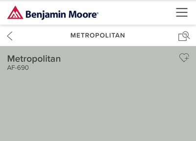
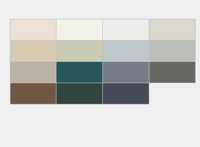
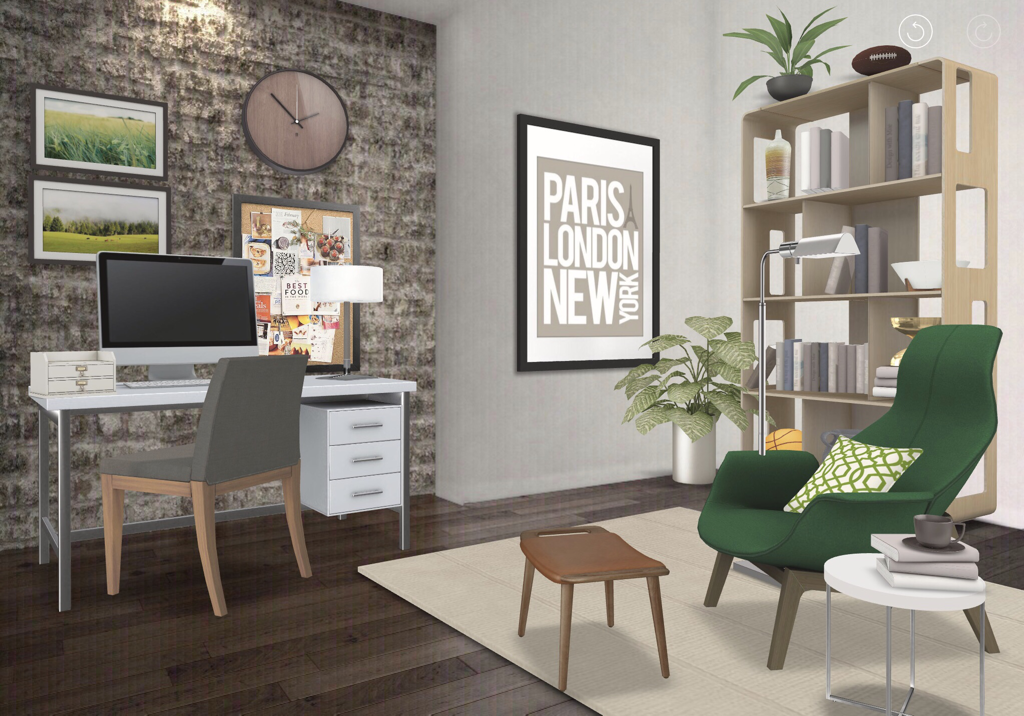
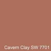
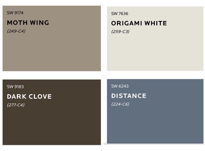
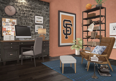
Hi Everyone and thanks for checking back with me. My last couple of posts have dealt with colour, Colour Schemes and how to use it effectively in your interiors. Today I thought I’d go off on a little Colour Tangent and talk about two wonderful paint companies’ “Colour of the Year 2019” selections that have just been announced. It’s a very exciting time of year for us Designers when this happens - it’s not like “The Oscars” exciting but it’s close. Like “The People’s Choice Awards” exciting. Anyhoooo, two renowned paint companies - Benjamin Moore and Sherwin Williams - have just announced their selections for 2019 and I thought we’d talk about it. First of all, I like both of these companies and will give them equal time in this post. Asking me to choose between them is like asking me to choose between pie and cake or pick my favourite episode of “The Partridge Family”. You just can’t do it. What is great is that they’ve both picked very different colours to showcase for 2019 which I hope will make for a nifty Design experiment on this post. Now, you’ve probably heard about this *Colour of the Year* business from watching design enthusiast shows like Cityline or Marilyn Denis and wondered how these selections happen. Basically, these companies have a think tank of smarty pants (some of whom I even know and spoke to about this so I got the skinny straight from the source) who analyze trends and influences such as fashion, decor, entertainment, political climates, the state of affairs, etc. and find a colour in their existing fan decks they think best represents those things and how it will move us forward. The companies have several higher ups around the world who get together, present their findings, and look for common threads to come to their final decision. Surprise! The CotY is not a NEW colour they create - they narrow it down from their 1000s of hues. Also, it isn’t just some marketing ploy to boost sales or some Anna Wintouresque CEO simply pointing to something on a whim. They spend months researching on the global level to make their choice. Along with the CotY, they suggest a palette of hues and trend colours as well as textile choices you can use to combine a trendy look. This might all seem very confusing for you in terms of what you should be doing with all the suggestions they give you. So, I thought it would be fun - and demystifying - to do another “1 Room, 2 Looks” experiment where I design the same Den using each of their respective CotY and combination suggestions to interpret two distinctive looks. Let’s begin! Benjamin Moore Colour of the Year: Metropolitan AF-690So here is Benjamin Moore’s choice: Metropolitan- a cool silvery Grey they suggest pairing with layered greys, neutrals, greens and crisp whites. They also suggest shiny metallics for a clean, modern and sophisticated feel. So here’s the CotY and coordinating palette: So, keeping in mind we’re using Metropolitan with some selections from the Colour Trend palette and shiny metals to create a sophisticated Den as suggested by the creatives at BM, the look I Designed is this: Room Design By Steve Ryan Designs - Created Using HOMESTYLER AppSo you can see, I’ve combined Metropolitan with greys, tans, whites, chromes and hunter green to create a Den that is very sophisticated and contemporary. Also, while the CotY is the wall colour, the other trend colours appear in the fabrics, textiles, and case goods - and I didn’t pick all of them - I just took some suggestions and pulled the look together. Sherwin Williams Colour of the Year: Cavern Clay SW 7701Sherwin-Williams picked Cavern Clay as their CotY. It’s an earthy, orangey brown similar to a terracotta pot. It’s much warmer and rustic - almost desert inspired. They suggest pairing it with off whites, dark browns, tans and blue-greys : They also suggest pairing it with rustic elements like raw/heavy woods, leather and natural fibres. So I took all those suggestions and interpreted them into this Den: Room Design By Steve Ryan Designs - Created Using HOMESTYLER AppYou can see that this room is cozy and much more rustic than the previous with its dark woods, wrought iron metals and leather. You’ll also note, the furniture layout, floors/exposed brick stay the same. I’ve only changed the wall colour and combined them with the colours and textures each company suggested to achieve these two very different looks. Let’s see them in a side by side comparison: So there’s a few things I want you to notice here. While I put the CofYs on the walls of both rooms, you don’t have to. You can do a focal wall, paint only your doors, use a tinted or shaded version or use it as a fabric or textile colour. Also, I used the suggestions each company made and my rooms came out exactly like they predicted. The Benjamin Moore room looks sleek and contemporary (like they say their CotY is) and the Sherwin Williams room is warm and rustic (like they said their CotY is). I hope this gave you some guidance on how to interpret suggestions and design trends for your Interiors and cleared up some of the confusion you might have had. You can really take them as your jumping off point and play with them to best suit yourself. Paint is the cheapest, easiest way to transform your rooms with major impact so consider using one of these CotY in your own space. What’s great about both of these companies is they both offer lots of advice and insight on how to best use their products. If you’d like to learn more about the tools they have available, I suggest checking out their websites or visiting a location near you.
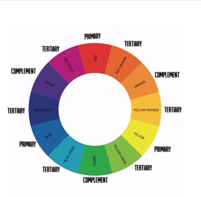
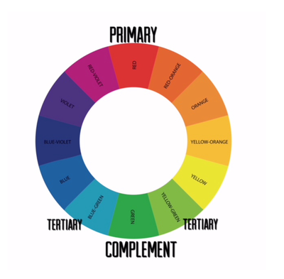
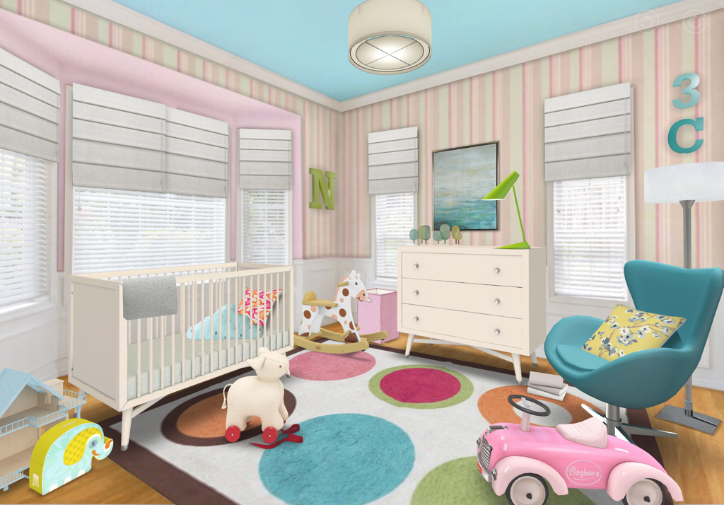
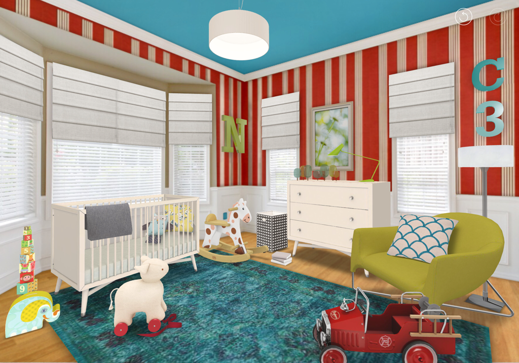
Thanks for reading and feel free to comment on what you’ve read here or if there’s something you’d like to see a future post on in the comments section. Until next post, keep striving to live the Well Designed Life. Steve Hi Everyone and thanks for checking back with me. In my last post, “One Singular Sensation”, I taught you about the Monochromatic Colour Scheme and showed you how to use it in your interiors. Well, now I feel confident that you’re ready to move on to a Colour Scheme a little more challenging: the Split Complementary. If you really want to embrace colour this is a great one for you and I think it’s super clever. Here’s how it works. In the spectrum of colour seen in the Colour Wheel there are three main colours (Red, Blue, Yellow) called “Primaries”. This is because they, along with black and white, cannot be created by any other colour. The Primaries all have “Complements” that fall directly across from them on the wheel (Green, Orange, Violet respectively). The Complements are derived from mixing a Primaries’ other two Primaries - ie Red’s complement is Green because it’s made from mixing equal parts of Blue and Yellow. Now, between the Complements there are “Tertiary’ colours that mix the Complements with a touch more of the other Primaries. This might be getting confusing so let me illustrate: (Tap Photos to Enlarge) So what’s cool about mixing a colour with its complement (known as a Complementary Colour Scheme) is they bring out the vibrancy of each other. In Split Complementary, we do they same thing but instead of using a colour’s complement, we use the *Tertiary* ones on either side (we split the Complement). How does that bring out the vibrancy, you ask? Because the Tertiaries have the Complement as their common hue. So if we pick Red, the Tertiaries are Blue-Green and Yellow-Green. Because they both contain Green, they bring the Green out in each other which plays off the Red thus bringing out the vibrancy in a three way orgy of colour! And it does it in a nifty and sophisticated way because it’s subtler than a Complementary Scheme which can be a bit more dramatic. So I thought I’d show you by designing a room in a Split Complementary Colour Scheme using that very palette of Red/Blue-Green/Yellow-Green and I’d thought I’d do something really fun. Soooooo I’m going to design a Nursery - one for a boy and one for a girl - using tints, tones and shades of that same Split Complementary palette and combine them to create two different looks. Here’s our palette: So now we have the palette, let’s put it to use in our two Nurseries for comparison: Girl’s Nursery designed by Steve Ryan Designs - Created Using HOMESTYLER AppHere you can see I’ve used tinted shades of the palette making them softer and more feminine. You can mix tones of the palette (ie the blue-greens or pinks could’ve been darker ) but you can seen how colourful the room looks because the three hues are playing off each other. I’ve also balanced all that colour with white so it doesn’t get too crazy for the eye. Boy’s Nusery designed by Steve Ryan Designs - Created Using HOMESTYLER AppIn the boy’s nursery you can see the hues still play off each other even though they’re more shaded. You’ll also notice I’ve made minimal changes in the rooms - most of the furniture is the same. I’ve really only used Colour to change the look and feel. In the girl’s room pink is more dominant and in the boy’s the blue-green is more dominant which completely changes how the rooms feel. However, both of these rooms have a real vibrancy and zing to them by using the Split Complementary scheme because of how the three hues play off each other. I realize that this is a bold use of colour but in a room like a Nursery, Laundry or Powder Room it makes for a really fun look. If you wanted to use a Split Complementary scheme in a subtler way, you could do it as easily as wallpapering a room or focal wall with wallpaper that contains the three hues but keep the rest of the room neutral with whites, greys, beiges and a few well placed accents of the three colours. Once again the amount of colour you use is up to you and your comfort level.
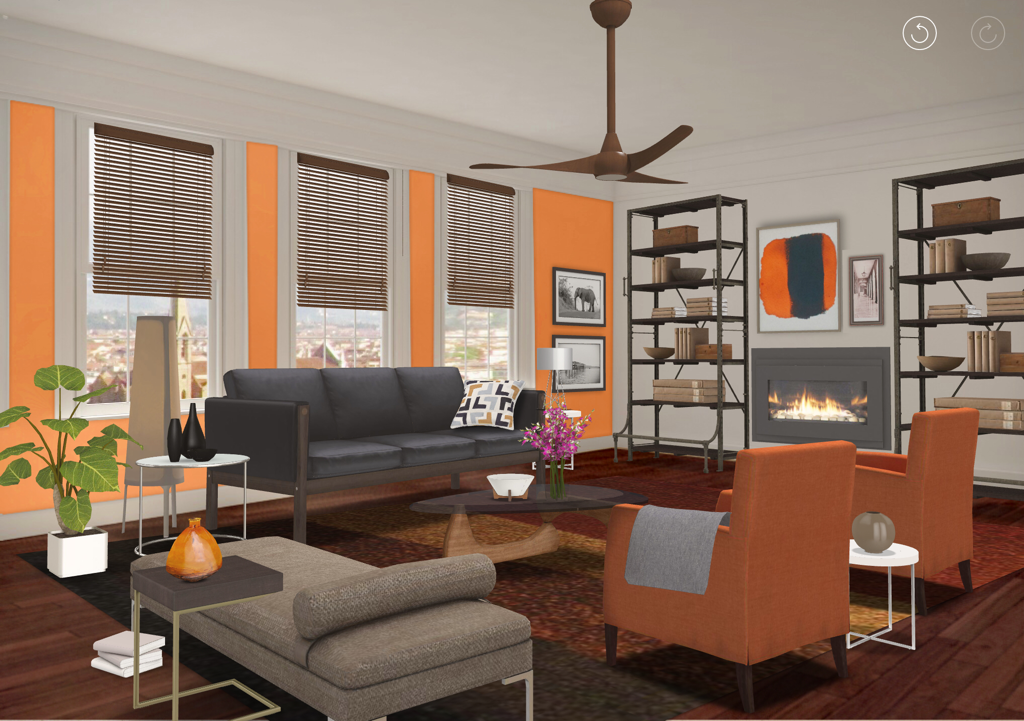
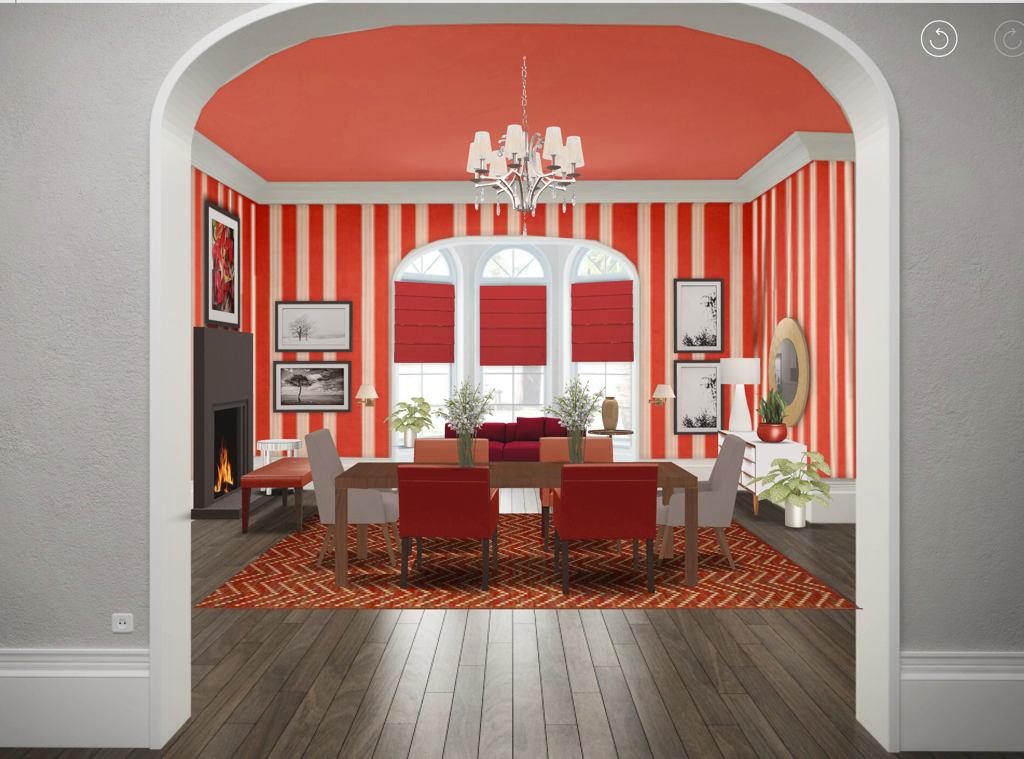
So I hope that gave you some confidence in using colour in a room in an unexpected way and showed you how using different tints, tones and shades of your chosen palette can dramatically change the look and feel of your interiors. Also, feel free to leave comments on things you might like to read about here. And, be sure to like Steve Ryan Designs on Facebook or follow us on Instagram @steveryandesigns. Thanks for reading and striving to live the Well Designed Life Steve Hi Everyone and thanks for checking in with me again. In my last post “Orange Is The New Black” I talked about decorating with orange on the large, medium and small scales (if you haven’t read it go back and read it first because a) it’s genius if I do say so myself and b) this post will make waaaay more sense to you). This time around, I’d like to take what I told you in that post and give you a lesson in decorating with a colour scheme. There are several (Achromatic, Monochromatic, Complimentary, Split Complimentary, Double Compliment ,Primary Triadic, Secondary Triadic, Broken Hue) but I thought I’d start you off easy with *Monochromatic* (using ONE COLOUR). It’s the easiest scheme using colour and, as I’ll show you, you can use a little or a lot of your chosen colour and not screw it up. For this first example I thought I’d do a Monochromatic Colour Scheme using last week’s heavy hitter ORANGE (in case you thought using orange was cray cray). Not only will I decorate a room using orange but I will incorporate the large, medium and small scales that I talked about in last week’s post (which you’ve read by now) so you can see it in action. To all you orange naysayers, behold: Room Design By Steve Ryan Designs - Created Using HOMESTYLER App So here is our good friend Orange used in a contemporary space. You can see I’ve only used orange, neutrals and metallics (Orange is the one colour used hence “Monochromatic” - neutrals are achromatic and metallics don’t really have a hue). You can also see I’ve used it on the large (focal wall colour), medium (armchairs) and small scales (art and accessories). Also, by only painting the window wall I draw your eye to the great view beyond - which I also talked about last week. Sooooo if you live in a condo, apartment or open concept home THIS is the way you should do a Monochromatic Colour Scheme I say (it’s tricky to figure out where to stop and start Colour in an open concept and painting every wall in an open space could overwhelm). This look is very easy to live with and achieve. If you live in a home with *delineated* rooms (clearly walled off and self contained), want to embrace a colour, make a real WOW statement and feel brave because you’re an avid fan of my blog and the wealth of knowledge I impart to you that fills you with confidence, then you might want to try using a Monochromatic Colour Scheme in a BOLD way. Like this: Room Design By Steve Ryan Designs - Created Using HOMESTYLER App
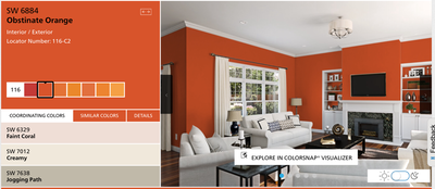
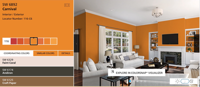
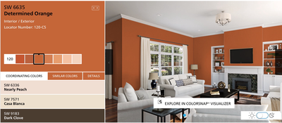
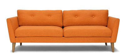
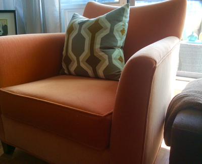
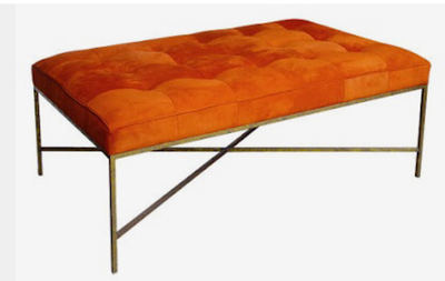
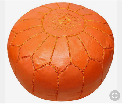
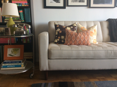
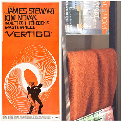
I know. You’re looking at that pic and just sh’t yourself a little. It’s ok. It’s just the WOW factor hitting you. You’ll be fine. Anyway, you can also see here I’ve still used the one hue (with waaaaaay less neutrals) still adhering to the large scale (walls, ceiling), medium scale (chairs, rug, bench, chaise in window, blinds) and small scale (art and accessories). And again I drew your eye to the view using colour as focal point with the red chaise and blinds in the bay window. However, because I’ve used much more large scale colour than the first room, the result is far more dramatic. If you live in an open concept space, you can see this might be hard to live with but because this Dining Room is clearly separate from the house (note the grey walls of the hallway that likely permeates the main spaces) it’s very livable. Also, notice the reds aren’t all the same. When using a Monochromatic Colour Scheme, use tints, tones and shades of that chosen hue to create visual interest. I recommend a Monochromatic Colour Scheme like this for rooms you don’t use very often or are more private spaces such as a Dining Room, Den, Laundry Room or Basement. I especially recommend it for a separate formal Dining Room like this because it’s likely only used occasionally and this look will make those occasions more grand. So my Gentle Readers, I hope this post gives you some confidence in incorporating a colour into your interiors. The best part is, you can use as much or as little as you like so it’s perfect for the colour phobe as much as the colour enthusiast. As long as your space reflects who you are, you really can’t screw it up Thanks for reading and check back with me soon to learn more. Until then, keep striving to live the Well Designed Life Steve Hi Everyone and thanks for checking in with me again. With Fall officially upon us, I thought I’d write this post about decorating with my favourite (and challenging) colour: ORANGE! I know you must think I’m crazy but orange is a great, warm colour that can add coziness or zing to a room depending on its hue. Orange used in a room with a lot of white can energize it while orange used in a room with browns and greys warms up those darker tones. So let’s explore using orange in a room as a wall colour (the biggest impact), large pieces (strong but lesser impact) and accessories (hits of colour). Beginning with wall colour you must first understand that colours can be vibrant or shaded. Vibrant refers to a colour having a “zing” and Shaded refers to it being slightly greyed and more subdued. Each can be effective in creating the mood and feel you want in your rooms. To illustrate this, here’s some help from the good people at Sherwin Williams: You can see in these photos, the room on the left uses a very vibrant orange. This gives real energy and drama to the room balanced with all of the white furniture and actually appears brighter. The middle picture uses a more shaded orange that has a bit more yellow and brown in it (think Butternut Squash). You can see how the room feels cozier and less dramatic (there’s less contrast between the orange and the white) even though the oranges are both very saturated. The picture on the right is a much more shaded orange - more of a cinnamon/nutmeg orange. There’s a lot more brown in it (there is no Brown on the Colour Wheel. It’s a broken hue derived from orange. That’s why browns and oranges work so well together). What is most noticeable in this picture is how calm and cocooning the room feels. Even the white furniture looks more grey-beige than white. Also, at night this room will look even cosier (light is how we see colour - more on that in a future post). Personally this is the type of orange I would recommend if you wanted to experiment with an orange wall. It looks great in many interiors - traditional, transitional, modern, rustic - and would look awesome in a basement, a den/office, entry foyer or as an accent wall in a main space especially if you have a lot of warm whites or walnut to chocolate browns in your floors, trims and furniture. Here you can see using orange on the large scale as a wall colour has your biggest (and least expensive) impact and is also the easiest to change down the road when you want a refresh. Moving on to using orange on a medium scale. This can still provide a powerful punch of pizazz to your space especially if it’s generally neutral (say White/Beige/Grey walls and mid tone walnut floors). People really like neutral spaces as they are very harmonious and calming but adding a furniture piece in a strong colour like orange breaks up the monotony. It’s still calm but there’s more life and visual interest. Plus that item will really be a conversation piece. You can see from these furniture selections how they bring a warmth and energy with them. When mixed in with your neutral space they really draw focus which can be super effective. For example, if you live in a condo with an ugly view, placing that papaya sofa on an opposing wall draws focus to it and away from that unsightly view. If you have a great view, placing it in front of the windows draws your eye to the view and can make your space appear larger: you see the sofa, then the view beyond which makes it feel like that window wall is farther away. Also consider using a bold colour like orange on your balcony furniture. It will also pull your eye to it making your balcony feel like it’s a part of your space, not a separate area. This all works to make a space feel larger and more open. If you’re really Colour Phobic but want to try spicing up your Interior with orange the best way to go is through accessories. These are small pops of colour that come by the way of your pillows, throws, art and objects. In these images you can see how hits of orange in the pillows, throws and art can be used effectively without overpowering the overall look of your Interior because it’s on the small scale. Even something as simple as flowers or a bowl of fruit prove useful. And adding a small appliance like a mixer or espresso machine in a juicy hit of vibrant orange can really add some life to an all white kitchen. Furthermore, placing these hits of the same colour around your room creates a repetitive rhythm that gives your space “movement”. Your eye sees these small hits of colour repeating in your space, your brain recognizes they are a common element, and so you naturally look throughout the space from one pop to the next. It’s an effective way to use colour to create visual interest even if colour makes you nervous or you fear you’ll screw it up.
So if you’re thinking of adding some spice to your Interior life, whether on the grand or not-so-grand scale, I highly recommend you take a cue from Mother Nature and try the Autumnal hues of orange. Be sure to check back with me for my next Design blog post. Thanks for reading and continuing to strive for the Well Designed Life. Steve |






 RSS Feed