|
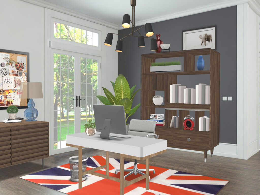
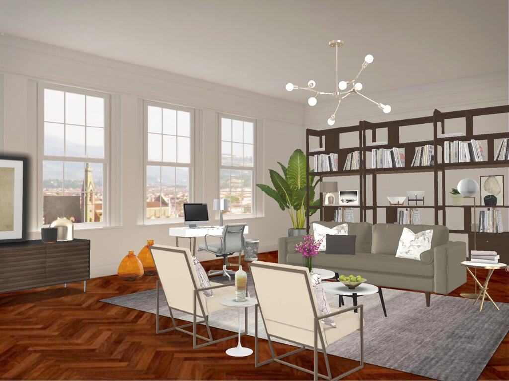
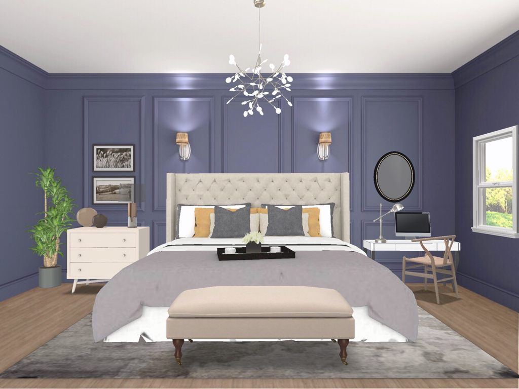
Well, gentle reader, it’s been a while since we’ve talked and I’m guessing you have a lot of free time on your hands thanks to the COVID-19 pandemic. I do too. Maybe you don’t because you’re having to work from home. So that got me thinking about what it is to work from home and how you can have a home office space you’ll delight being quarantined in. I’m going to give three examples of home office spaces from best to least ideal: a separate office or den, an office area in the main space, and a office niche area for the space challenged. Let’s look. The Home Office or DenIf you have a separate den or room for a home office you’ve hit the work from home pay dirt. You’re like the Dad on “The Brady Bunch”. Not only can you work comfortably from your home but you’ll have an easier time keeping from being distracted by outside temptations or Jan whining about Marcia, Marcia, Marcia. Also, you can decorate the space to suit your needs but keep in mind there are some must haves: - a good desk. This is obvious but placement of your desk is key. Placing a desk facing a wall is something you should try to avoid. It’s best to place your desk facing out into the room corporate style. This allows you to see people coming into the space and lets your energy expand rather than be stymied. - storage. You’ll need some type of cabinet or credenza to hold things like files, your printer, etc. that’s closed so those items can be tucked away. - shelving. Shelves can hold any books or reference items you might need to put your hands on quickly. - a comfy chair. It should give good back support and ideally be on wheels so you can move it often without scratching your floors. - good lighting. You’re likely going to work early or late at some point when it’s dark out. You’ll need some ambient lighting plus some directional task lighting for your desk. Let’s look at an example room: So here you can see our must haves. Desk facing out, comfy chair, credenza to tuck away clutter, shelving for quick access and ambient table lamps and some directional ceiling light to illuminate the work area. The separate home office also has a couple of bonuses. You can use punches of colour on walls or floors to energize you and have space for things like organizational boards or calendars to keep yourself on track. The Main Space Office AreaIf you don’t have the luxury of a separate den, your next best bet is the “office area”. The office area is a designated zone of a larger area. The office area may or may not be used as frequently as a home office but the same rules can apply. Let’s look. So here you can see we’ve carved out an office zone in the main living space. Here we couldn’t do our *don’t face the wall* rule so we cheated by placing the desk looking out a window. This is your second best option because it allows you tuck the desk out of the way but because you’re looking out the window you feel like you’re not facing a wall. We still have a comfy chair, ambient lighting, task lighting on the desk itself this time, shelving and closed storage. The trick here is that shelving and storage are part of the larger room so they should fit the decor style accordingly. Also, they might not be as close by as they would a den so you might have to walk a few more steps to access them. The Office NicheThis last scenario is for someone who doesn’t work from home a great deal but needs a spot to work from occasionally and may not have enough room in their main space. So here, we’re basically talking a desk in a corner. It’s not great but we can still apply some of our must haves to make it the best it can be. Here we’ve tucked a desk next to the bed in lieu of a side table. This is a clever double duty idea because it serves as a workspace and a bedside table. Yes. We had to face a wall but we did put it in the corner near a window so your energy won’t feel as trapped. If we put the desk in the other corner it would feel like cruel and unusual punishment. Also placing a mirror on the wall will bounce light around and reflect the room so it won’t seem so closed. We still have a comfy chair but not office style as it wouldn’t fit the room decor but you’re likely not using it a lot anyway. We still have our ambient and task lighting. Any shelving or closed storage will likely have to be somewhere else in the home but again you’re likely not running an empire from the office niche.
So, I hope this has given you some inspiration for creating a Home Office that will really work for you. Until next time, thanks for reading and keep striving to live the Well Designed Life. And please, stay home and stay safe. Steve
2 Comments
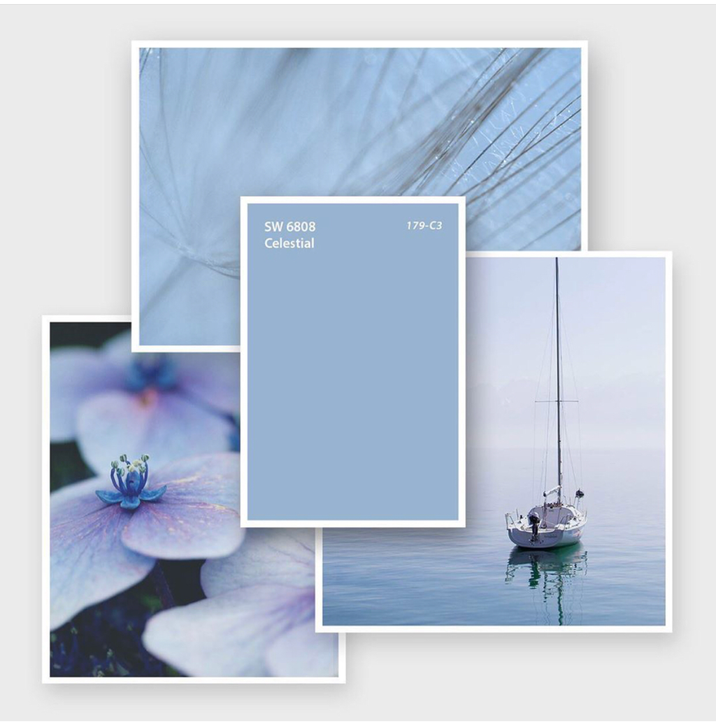
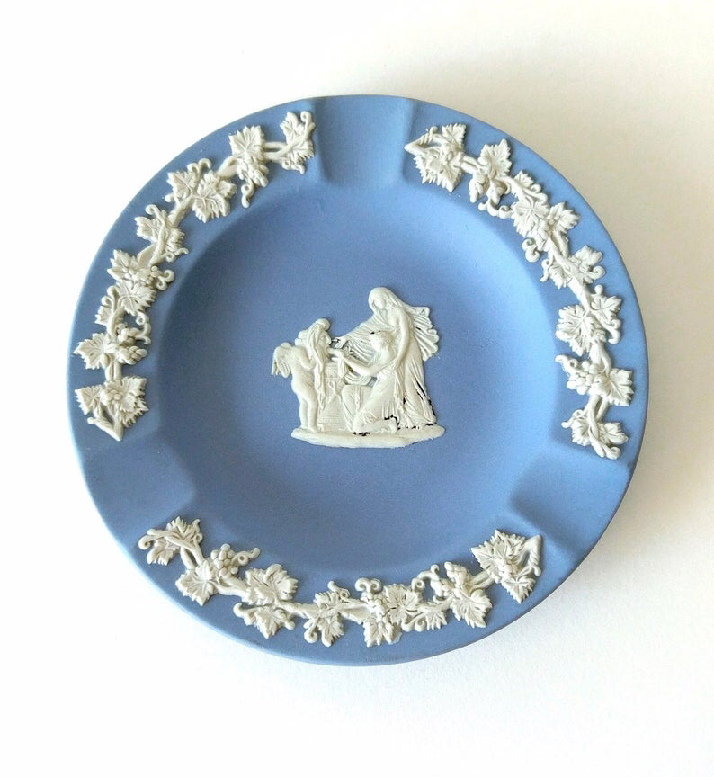
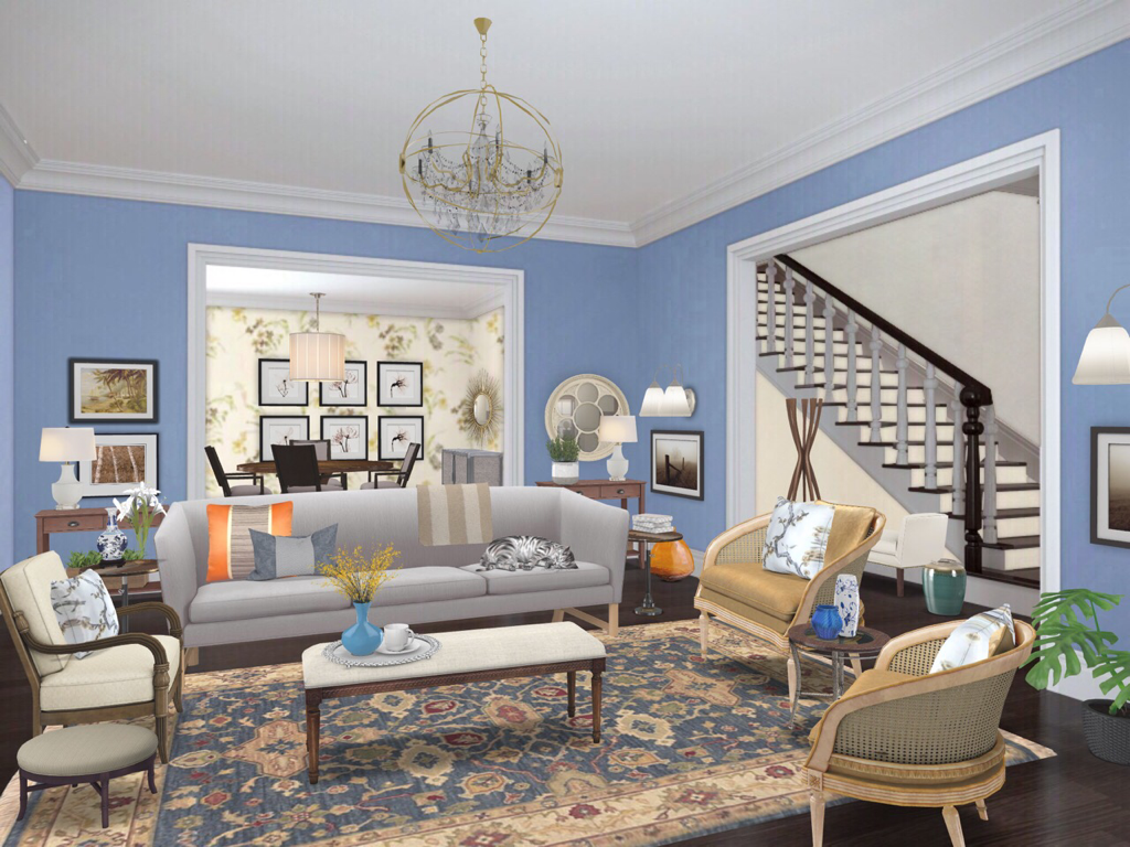
One of the issues in Design and Decorating I hear about a lot from people is that they don’t know where to start. They may have an idea of what they want from a room but they can’t figure out how to get there or pull it together. This is the Creative Process. It’s a weird, organic thing that kinda springs from within that can seem foreign to the average person but Designers get really comfortable with the uncomfortableness of it. So this post I thought I’d take you through how I start a decorating a room all the way to the final product for a traditional looking living room. The Starting PointFor this living room project, we’re going to use a wall colour as our starting point. Your starting point can be anything. A fabric you love. A sofa you just had to have. The trophy home Diane Keaton lives in in every movie. Paint is often a good place to start if you like colour and want to use it. For this, we’ll use Sherwin Williams Colour of the Month for June, “Cerebral”: Cerebral is a very calming, soft French Blue. Since I’ve decided this room will be traditional in style, I start by thinking what traditional things I might equate with this colour. When I look at this colour, it reminds me of the Wedgewood China my Mother collects. This is good because Wedgewood China is also traditional so that will become my inspiration for our room. The InspirationSo here’s a piece of Wedgewood to give you an idea of what’s inspring me. I know I’ll use the blue on the walls and I’ll incorporate white to mimic the crisp feeling it has. The China isn’t overly ornate so I’ll keep the room a similarly clean space. I know I’ll be using traditional furniture and I’ll be sure to use lots of curved and round items to relate back to the curves of this ashtray and I’ll look to incorporate some kind of floral or curvy patterns somewhere to nod to the patterns on the piece. Then I start selecting the pieces and items I think will work. Once I’ve selected my furniture and other items, I’ll collect images of them with fabric and paint samples into a collage to see how they work together (using a collage app makes it easy). I add, remove or replace items until I get a collection that evokes a room that “feels” like my inspiration. There’s no linear way to this point and I can’t quite explain it, but it just kind of develops. I just keep thinking about my inspiration and what I’m trying to achieve with the room and it happens. I often use the analogy of a rehearsal. In rehearsal you try the set elements in different ways, keeping what’s working and throwing out what isn’t until you reach what you’re trying to say overall. It’s that same fearlessness/willing to fail/eye on the prize combination that performers use in rehearsal that gets you your greatest reward. The Final RoomAnd here we are. You can see I’ve used our Celestial paint on the walls with white trims and ceilings like our Wedgewood inspiration piece. I’ve used patterns in the rug reminiscent of the detailing on the inspiration piece. The furniture is traditional (tighter, feminine, more leg, curvy, caning, etc) to fit in with our goal of a traditional looking space. I literally sourced out items and combined them until I got just the right fit. That was the Creative Process at work.
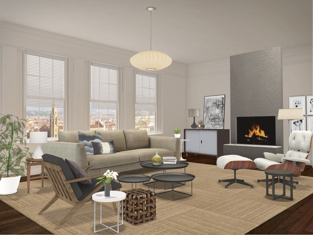
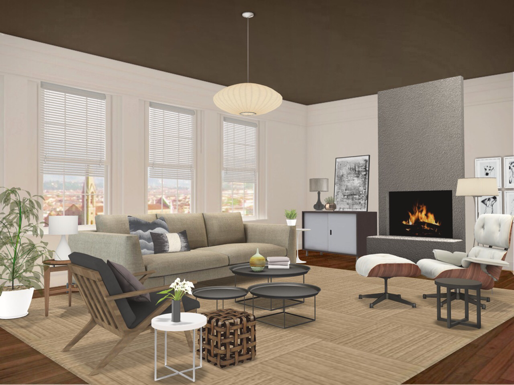
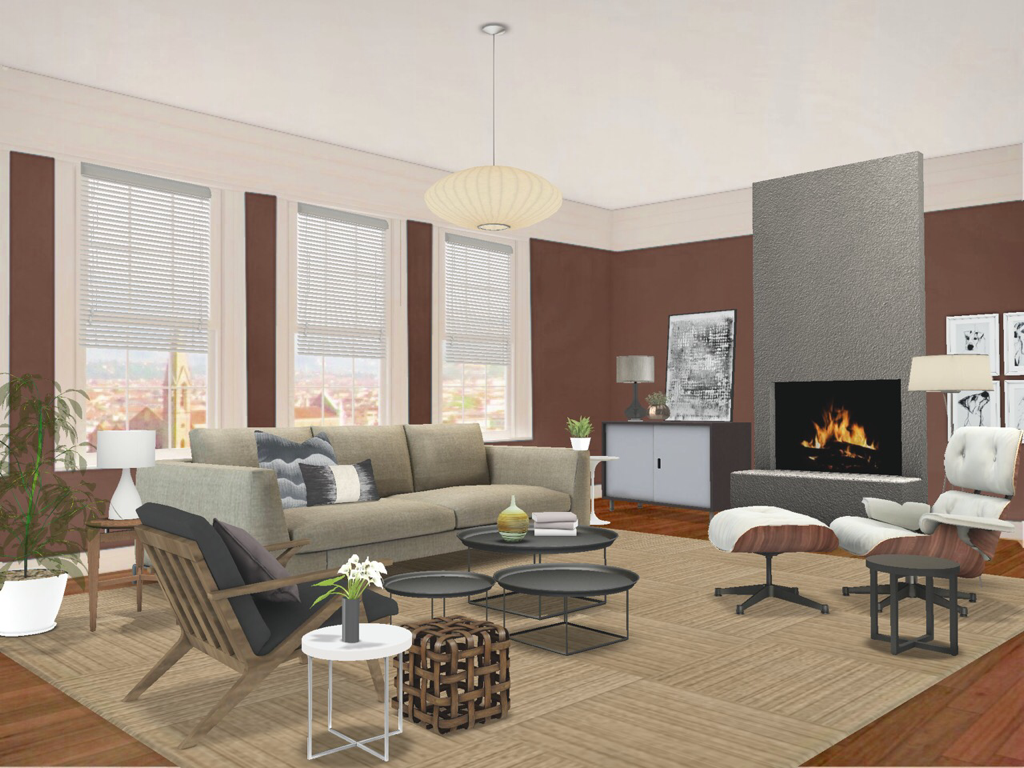
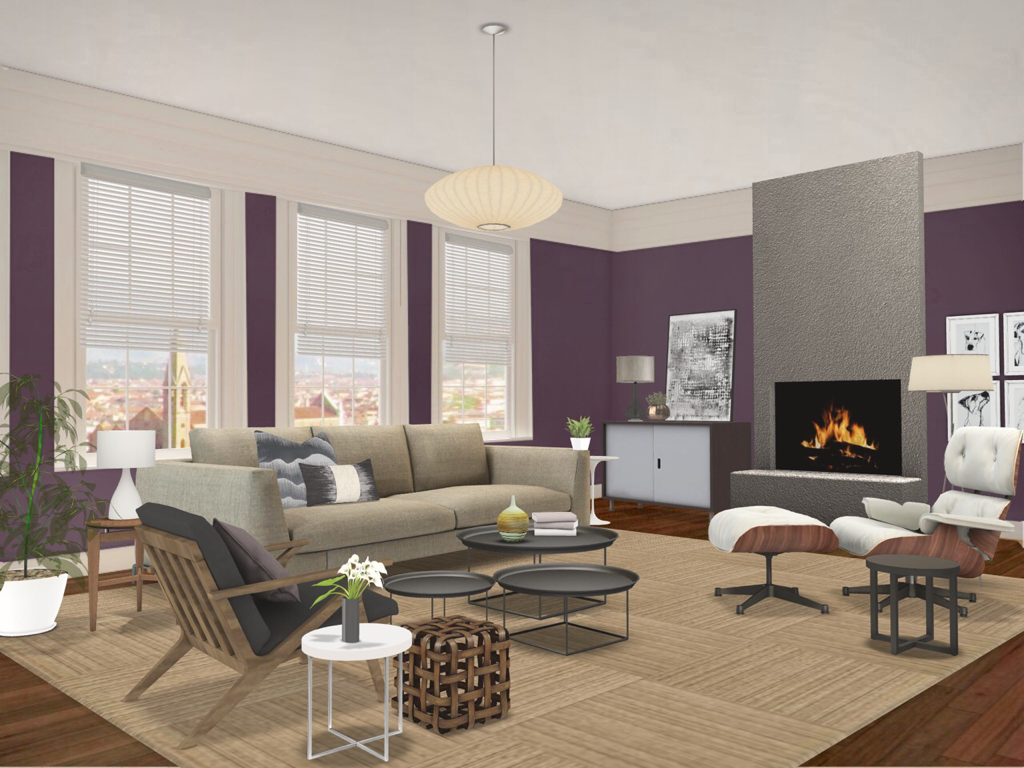
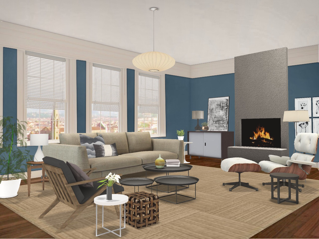
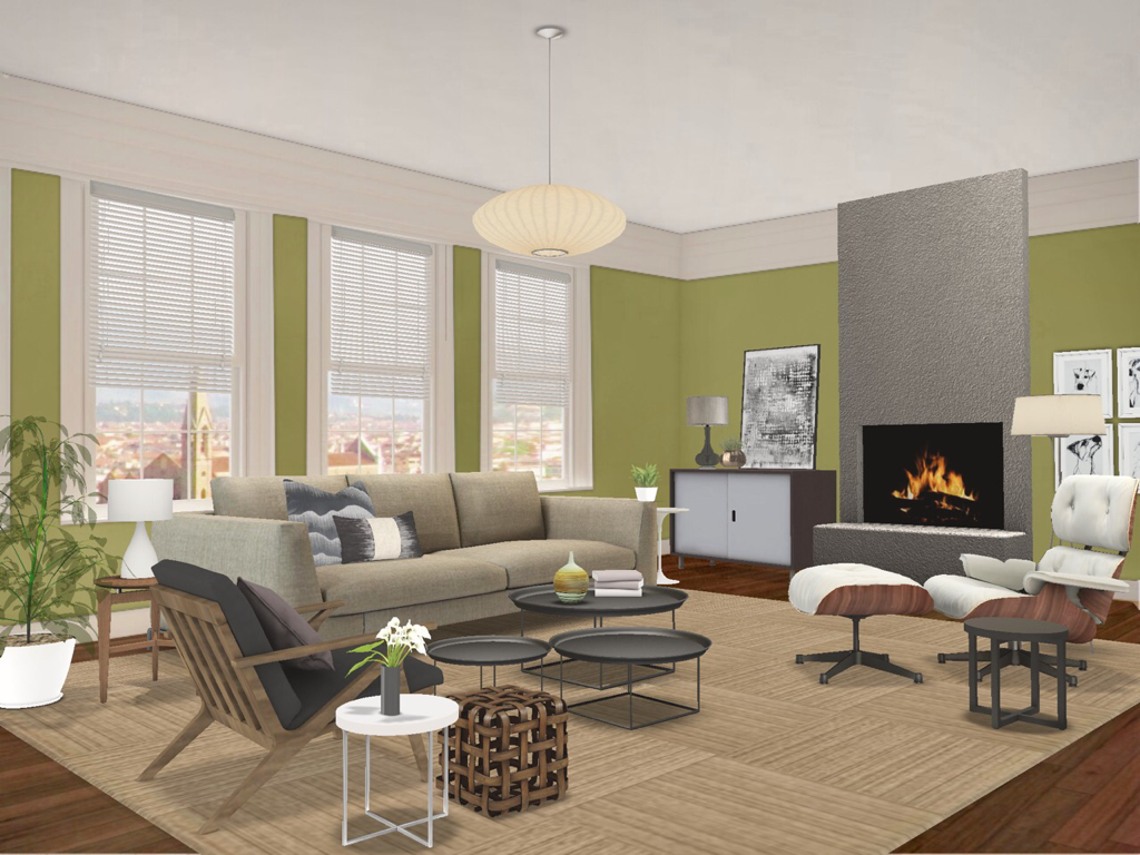
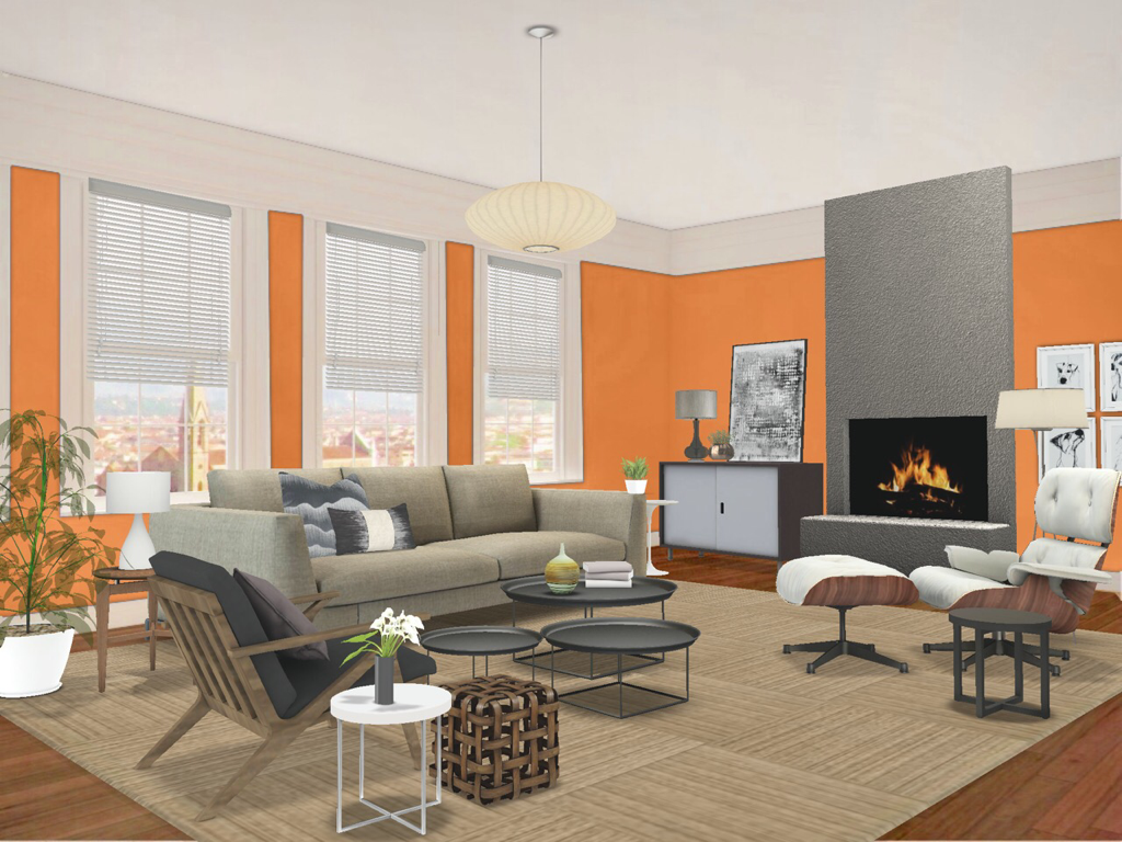
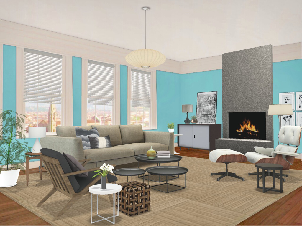
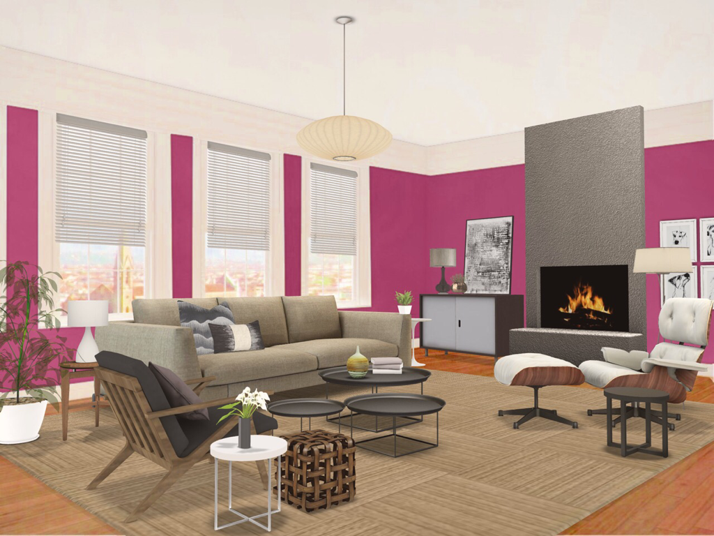
I hope this gives you some confidence in finding you way through the Creative Process. It can feel like a bit of a mine field but it’s really not that scary as long as you pay attention to where you’re stepping. Until next time, thanks for reading and striving to live The Well Designed Life. Steve Yes. It’s a real thing. National Painting Week runs the first week of June. I’m not sure why, but I suspect it’s generally consistently warm and sunny enough that you can do your outdoor painting and have windows open for your indoor painting. Makes sense. Anyhoooo, todays blog post is about the magic of paint. Not only does it hide a variety of sins and can unify cabinetry but it is absolutely the cheapest Decorating tool that gives the most dramatic change. Plus you can paint so many things. Walls, floors, ceilings, cabinets, furniture, picture frames, metal, glass. As long as you prep your surfaces properly, your decorating potential is unlimited. However for this post we’ll look at how painting walls can dramatically change the same room and hopefully give you guidance so you can choose your wall colours with confidence. The Neutral RoomSo this is our neutral Living Room starting point . I’ve used a very harmonious palette of beiges, greys, browns and whites. You can see that this is very calming and very easy to live in but kinda blah. Because it’s Neutral we can add any colour and create a totally different look. For this entire post, I will only be changing the room colour. All furniture and accessories will remain the same. So let’s do it. Colour on the CeilingHere we’ve simply painted the ceiling (also called “The Fifth Wall”) a dark colour to add some drama. Ceilings are a pain to paint but you can see how throwing a colour up there has a great effect and because it’s above the sight line it’s less intrusive. Note that ceilings get about 30% less light so they will appear darker once finished so choose your hue carefully. If you’re skittish about painting something, consider the ceiling. Dark and MoodySo here we’ve used dark colours on the walls. A lot of people think painting a room a dark colour will make it look smaller but actually the walls appear to recede. You can see how the brown is still harmonious like our first image and how the deep purple and blue have a bit more oomph while maintaining that coziness. This is definitely dramatic and using darker colours affects how light plays in your space. Your furniture and accessories will appear more sumptuous. If you want a room to feel cocoon-like, this is for you. Fresh and NaturalSo here we’ve used a deep yellow green on the walls. Green falls right in the middle of the colour wheel so they’re neither warm or cold. But when mixed with these neutral colours, especially the browns, you get a very earthy palette that’s fresh and still calming like our first image. It has a really peaceful feeling to it. If you’re a nature lover, consider using greens. Bright and VibrantHere we’ve used brighter, more vibrant colour on our walls. Using the spicy orange gives the room real punch but it isn’t over the top because there’s so much brown in the room. Brown is a broken hue derived from orange so this technically is a monochromatic colour scheme. Blue is the opposite of orange so it works great with browns because it’s basically a Complementary Colour Scheme. Thus, it has a little more zing because it’s playing off the browns. What you will see here is how the rooms look brighter than all the previous because of how light plays off the vibrancy of these shades. Be BraveOk. I get this isn’t for everyone. But what I wanted to show you here is that you shouldn’t be afraid to try. If you love fuschia or any bold colour then use it. This room still totally works and I think if you love it then you can’t go wrong in your decorating. If you’re feeling less than brave, try painting a cheap side table or chair that colour. It’ll still give you all the feels that you get from that colour you love. Your home should reflect you.
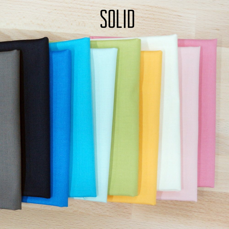
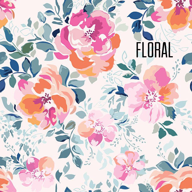
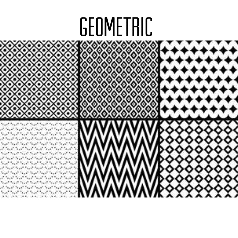
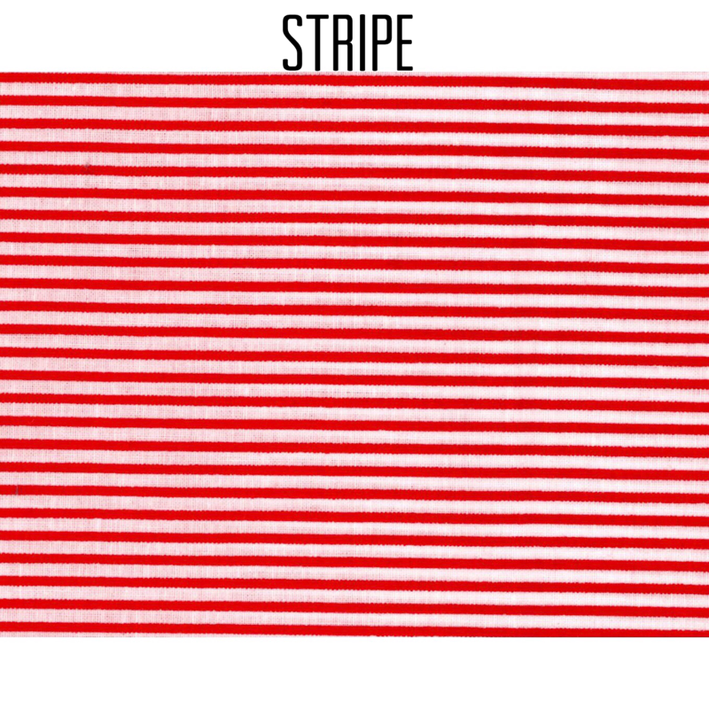
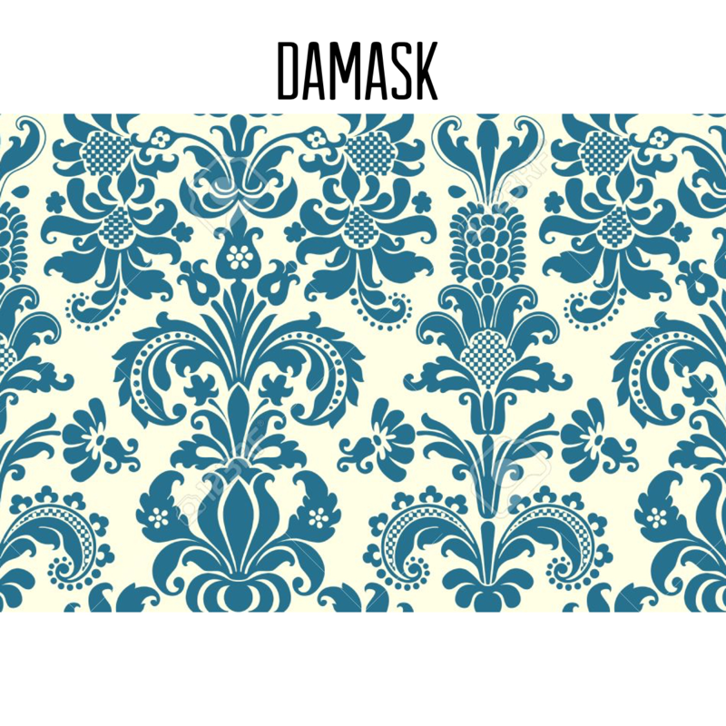
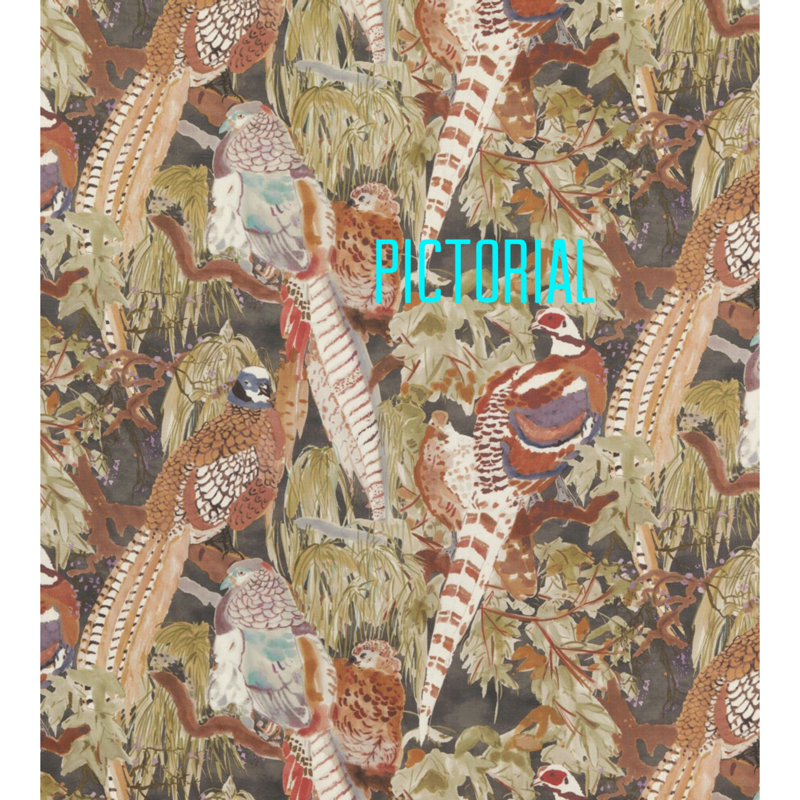
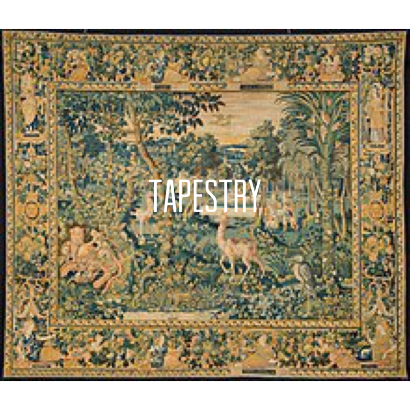
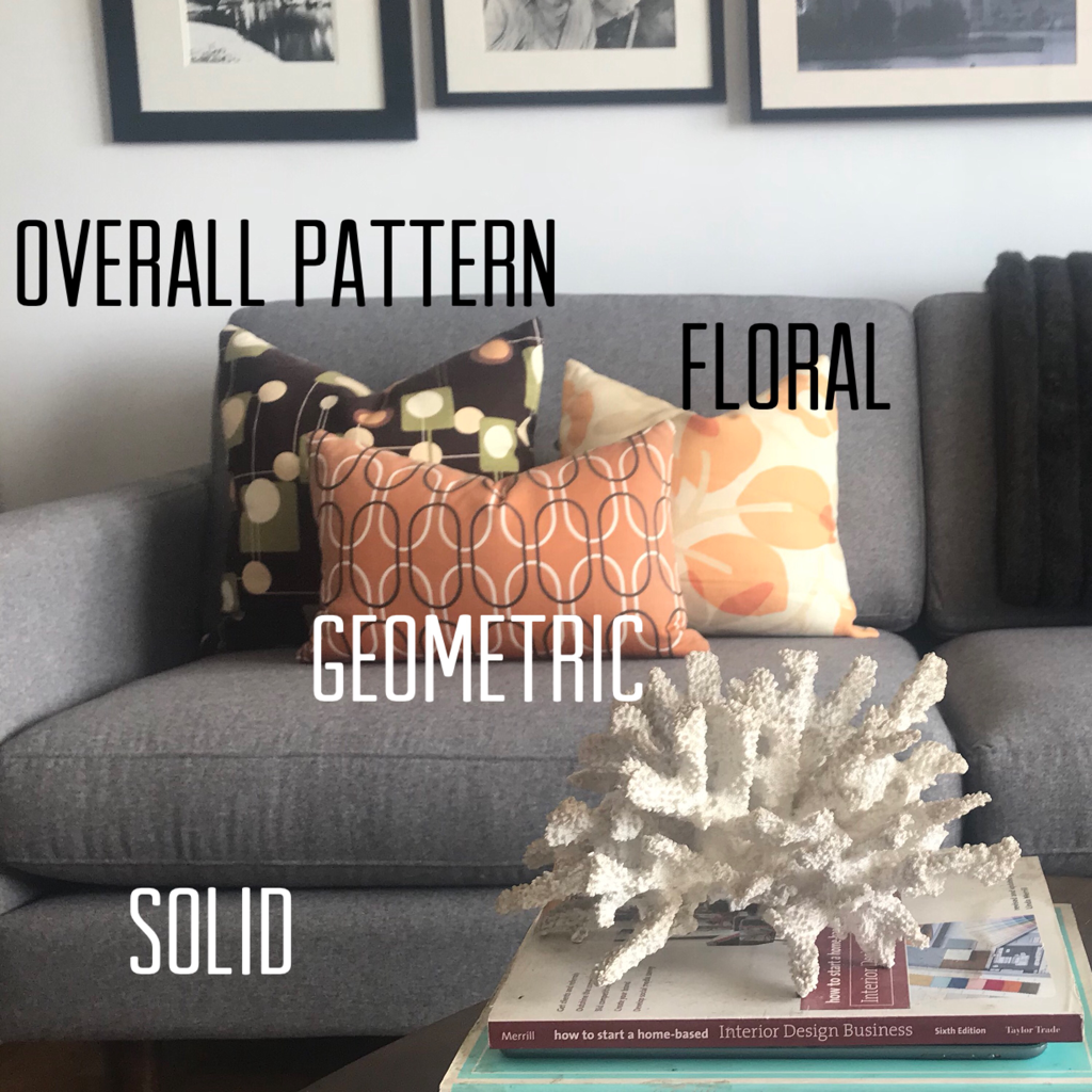
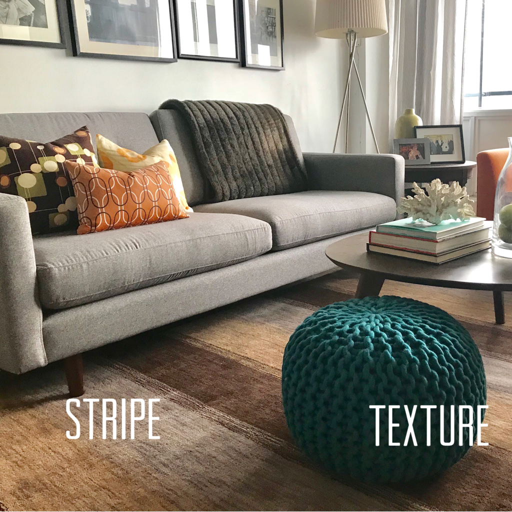
So there you have it. You can see how a little paint can totally transform a room. I realize it can seem overwhelming. Designers actually do Consultations just for colour but try not to get flummoxed. It’s just paint. If you hate it, it’s cheap and easy to change and the staff at your local paint companies like Sherwin Williams or Benjamin Moore can give you advice on what products will give you the best result you’re looking for. So grab a brush and jump into National Painting Week. Until next time, thanks for reading and striving to live the Well Designed Life. Steve If you’re the type of person who wants their space to feel calm, you’ve got it easy. Stick to mostly solid fabrics in a harmonious palette and you’ll knock it out of the park. But if a little more pizzazz is what you seek from your Interiors, you’ll want to bring that into play by mixing patterns. You’ve probably heard terms like “chevron” and “ikat” and immediately got confused and threw in the towel. So this post, I’m going to break the art of pattern mixing down, simplify it and show it in action so you can feel confident with it. So basically I find it’s easiest to group fabric pattern types into eight standard groups: Solids, Florals, Geometrics, Overall Patterns, Stripes, Damasks, Pictorials and Tapestries. Solids : these are the easiest. The fabric is one colour. You can’t miss this one. Florals: also a no-brainer. The fabric has images of flowers all over it. Geometrics: basically these are lines/circles/squares in a tight continuous robotic looking pattern. “Chevron” and “Check” would fall under this category. Overall Pattern: similar looking to Geometrics in its continuous pattern repetition and can contain squares and circles but it’s looser and more relaxed looking. “Ikat” and “Poka Dot” would fall under this category. Stripes: back to easy to spot. Bars of horizontal or vertical lines in a repetitious pattern. Damask: a traditional looking fabric using two colours. A solid background and ornate swirls in a secondary colour. Pictorial : a classic 18th Century fabric with trees, birds, leaves in an overall pattern repetition with a very pastoral look. Toile” would be part of this group. Tapestry: a heavy fabric, usually in muted colours depicting people and stories. This one isn’t used much in modern decorating unless you live in a castle. If you do, call me. So now that we have our eight standard types, how is the best way to mix them. To start, keep your colour scheme simple if you’re a novice. You can easily mix patterns with a totally neutral room or monochromatic room. I’m going to show you how to mix FIVE in one room with a monochromatic colour scheme. I’ll use Solid as my base. It’s likely your sofa fabric then add Floral, Geometric and Overall Pattern on the throw pillows: You can see how nicely that all works together and that they play off each other to give the room life and energy while the simple monochromatic palette keeps it clean, modern and easy to live with. Now I’ll add a Stripe into the mix in the rug: Now you can see how simple it was to mix five different patterns and they work together to give this room that little punch every room should have.
A Note About Texture: You can see there’s also a woven pouf ottoman used here. This is texture. Texture is using things like weaves or tactile elements like fur or exposed brick. I mention them because they basically act like Overall Pattern so they’re a great way to add pattern if you’re hesitant. The thought of mixing five patterns may be daunting and that’s ok. If you’re unsure, go with three and make sure one is a solid. This is easier to handle and use the other patterns in small doses like pillows. If you’re feeling braver, go for four or five patterns and use them on a much larger scale like bold patterns in a larger size on large furniture pieces, draperies or wallpaper. So don’t be afraid to mix patterns in your Interiors. You’ll love the way they take your rooms from plain to punchy. Until next time, thanks for reading and keep striving to live the Well Designed Life. Steve Now that Spring is fast approaching, I’m sure everyone is itching to do some cleaning out and freshening up. You might be thinking of getting your place ready for sale or jazzing up your place to make it better reflect your awesomeness. If you’re planning the former, feel free to contact me for Home Staging. If the latter, I give you My Top 5 Tips for creating the well designed life I push here and in my business. Let’s just dive in.
1 Spend Money If you think good Design is expensive, you should see what bad design costs. The cost of your home is ongoing and just like you coughed up for a decent lawnmower, snow shovel and deck stain, you can’t cheap out on your interior. This means you have to spend money, especially on things you use a lot like sofas, chairs, paint and appliances. A decent sofa should cost $2000-$4000 and be too heavy to pick up on one side with one hand. If you buy cheap, you’ll buy twice. Don’t let sticker shock get you. This brings me to #2: 2 Get A Line Of Credit The interest rate on a credit card is about 20%. A line of credit is about 3%. Buy things you need with your credit card (especially if you get AirMiles or CashBack points), then use the line of credit to pay off the card balance as soon as the bill comes in. Your bank will take manageable payments out of your account each month until it’s paid off. It’s way more fiscally responsible, you’ll barely notice the monthly payments and you’ll be less inclined to buy cheap. 3 Close Your Blinds When I was kid, part of my allowance earning chores was to pull the blinds down in our Living Room when I got home from school. An easy task I thought silly but my Mother was right to ensure it got done. Sunlight is as bad for your furniture as it is for vampires. The UVA/UVB rays that damage your skin will also fade the dyes of your upholstery fabrics and rugs and turn your silk drapes to dust. If you live on a tree lined street this isn’t a big one, but it’s a must for condo/apartment dwellers who get a lot of light. 4 Entertain Everything is energy including your home. Having people over for brunch, games nights, BBQs will fill your space with positive energy and keep your place ‘alive’. It also nurtures your friendships which is a super important part of life we often push aside when we get caught up in the day to day parts of life. It also combats our current trend of relating mostly through our phones. That can feel like you’re connecting or doing something real but you’re not. Use your phone to invite people over instead. 5 Look Your Best I have a simple rule for always looking your best everytime you leave the house and here it is. Every home should have two things : a full length mirror and brutal honesty. This may sound trite or harsh but it’s true. Give yourself the full once over before you head out everyday whether for work or play. And not just to ensure you don’t have broccoli in your teeth. If something is too tight or too big, ditch it. Off-the-rack suit a little shlumpadinka? Take it to a tailor. Rip in the seat of your jeans you didn’t know of? Grab your khakis or at least be wearing cute undies. Everyone is uniquely different but looking at yourself from head to toe and being truthful about the architecture of your body will ensure you always look great. So there you have it. My top 5 Tips I think everyone should know to have effortless style. It just takes a little effort. Until next time, thanks for reading and striving to live The Well Designed Life. Steve Each year there are always creative ideas in the ever-evolving world of Design. Some take off. Some don’t quite land. Some are short lived (I’m talking to you, rose gold). Regardless of consumer response the kitchen is the one area where trends are constantly developing because it’s the heart of the home and manufacturers are always improving their goods. So I thought I’d give my take on 10 trends that have been recently developing in the kitchen design field that I think are destined to stand the test of time. 1.The White Kitchen: I know, it’s not new and I could go on forever about how we’ve all been screwed by the White Trophy Kitchens of Diane Keaton Movies. However, the appeal of a white kitchen is undeniable. It always looks bright and clean. Designers will always get asked by Clients for one. It’s here to stay. Make your peace with it. 2. Integrated Appliances: cladding your fridge and dishwasher doors in the same paneling as your cabinets makes the kitchen look bigger and more seamless 3.Wall Oven In Base Cabinets: this is genius and totally in keeping with Integrated Appliances. Putting a wall oven in the base cabinet below the cooktop makes it operate like a stove but is cleaner and tighter. I don’t know who invented this but they deserve a muffin basket 4. No/Few Uppers: using no or few uppers also keeps the kitchen looking cleaner and more spacious. Plus you can take a cool backsplash right up to the ceiling for dramatic effect 5. Open Storage/Shelving: this is influenced by “Restaurant Kitchens”. Having open shelves or storage to grab things like pans or plates quickly appeals to the home chef or Martha Stewart wannabe 6. Contrasting Island: having the island stained or painted differently to complement your cabinets makes it a feature. It looks like a piece of furniture rather than a clunky pile of base cabinets with stools at it. 7. Wood(like) Floors: using hardwood throughout your house and carrying them into the kitchen makes the house look larger because there’s no breaks where the flooring changes. Vinyl flooring is especially great to use. It’s durable, looks real, is cheaper and your Client won’t freak if the dishwasher overflows 8. Tile Inlays: using an area of tile (or vinyl tiles) in an area of the floor, either in the centre of an open area or under the island is a great feature. It looks like a carpet and you can make some really nifty patterns 9. Clean Lined Designs: keeping the island the same height as all the counters makes great use of horizontal line especially in more contemporary kitchens 10. Unstructured Eat-In Area: having an eat-in area in a kitchen is great as sitting at an island is impersonal. Unstructured means instead of using a traditional table and chairs or banquette seating, you use a slim lined sofa with a table and chairs. It’s more like a cool coffeehouse or lounge and makes for a great spot to hang out in. So those are my 10 Kitchen Trends I think will be timeless. And just for fun and to illustrate my points, here is a rendering of all 10 used in one kitchen design. I hope it inspires you Thanks for reading and striving to live the Well Designed Life Steve Now that 2019 has begun, you’ve likely made a resolution or two. I like to think of these as “No Obligation Promises You’re Not Legally Required To Keep”. As we swear to tone up, eat better, get a new job, etc we tend to let these slide as January becomes February until abandoned entirely by March. So this post I’d like to give you Three Tips You Can Do Today To Improve Your Space. Minimal commitment. Moderate effort. Still makes a difference. Your home has an energy and what you do in it affects your life in ways you might not notice. Come CleanGiving your place a good clean works wonders. While we’re trapped inside during colder weather with the windows shut, things get musty. This is why Spring cleaning always makes us feel fresh. If you’re stuck inside on a blizzardy Saturday or Sunday get out your supplies and scrub your place thoroughly. Also, clean out your fridge/cupboards. I guarantee there’s lots of expired or useless crap in there bringing down your healthy vibes so toss ‘em and make way for better choices. The end result will make you feel envigorated and more relaxed about hanging out inside while the snow flies. This literally takes half a day so it’s a quick fix that makes a big change. Get OrganizedWith the recent explosion of Marie Kondo and her art of tidying up, there’s never been more interest in getting your closets organized. As a Designer/Virgo, I have known this joy forever but if it’s new to you, I highly recommend getting on the organization bandwagon. While you don’t have to feel up all your items, thank them for their service and origami your underpants until they can stand on their own, organizing your closets and drawers is amazing. First of all, you’ll rediscover items you love that you totally forgot you had. It’s like shopping your own wardrobe. Secondly, if you can’t remember when the last time was you wore something, why are you hanging onto it? Donating it to someone in need will make you feel grand and open up space for newness. Your home has an energy and if it’s cluttered and cramped you feel anxious. Getting rid of things opens your energy up to receive new people, money, experiences into your life. I do this a couple times a year and have a “Hanger Rule” where I have a fixed number of hangers. If I buy something new, something old has to go to make room for it on the hanger. A Lick of PaintBeing stuck inside in Winter is a perfect time to tackle a little Home refresh. Nothing is cheaper, easier and has greater impact than paint. Consider touching up your baseboards and trims. Maybe paint a room or do a focal wall colour or colour block. Using Sherwin-Williams ColourSnap App can let you try colours digitally so you can make the right choice. Even painting the doors to rooms or closets can have a huge effect with little time or effort. It’s amazing how paint can change a room dramatically in look and feel at such a small cost. The newness you’ll feel will carry over into your attitude and help you combat S.A.D. Of my three tips, this one requires the most time, money and effort but it’s still peanuts for the payoff you’ll get in return.
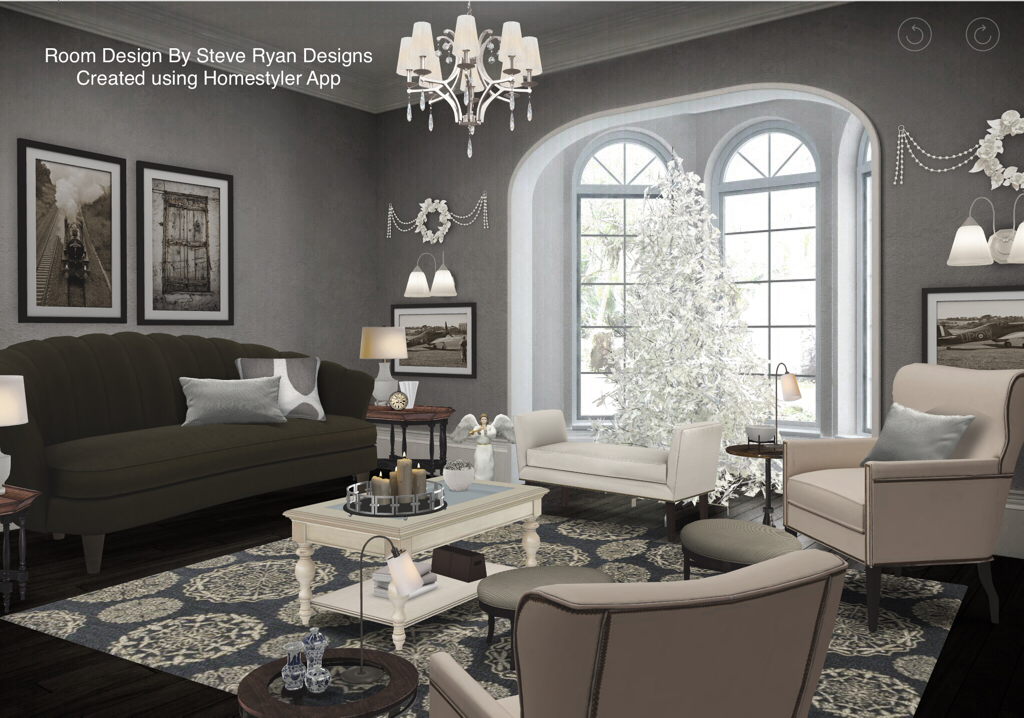
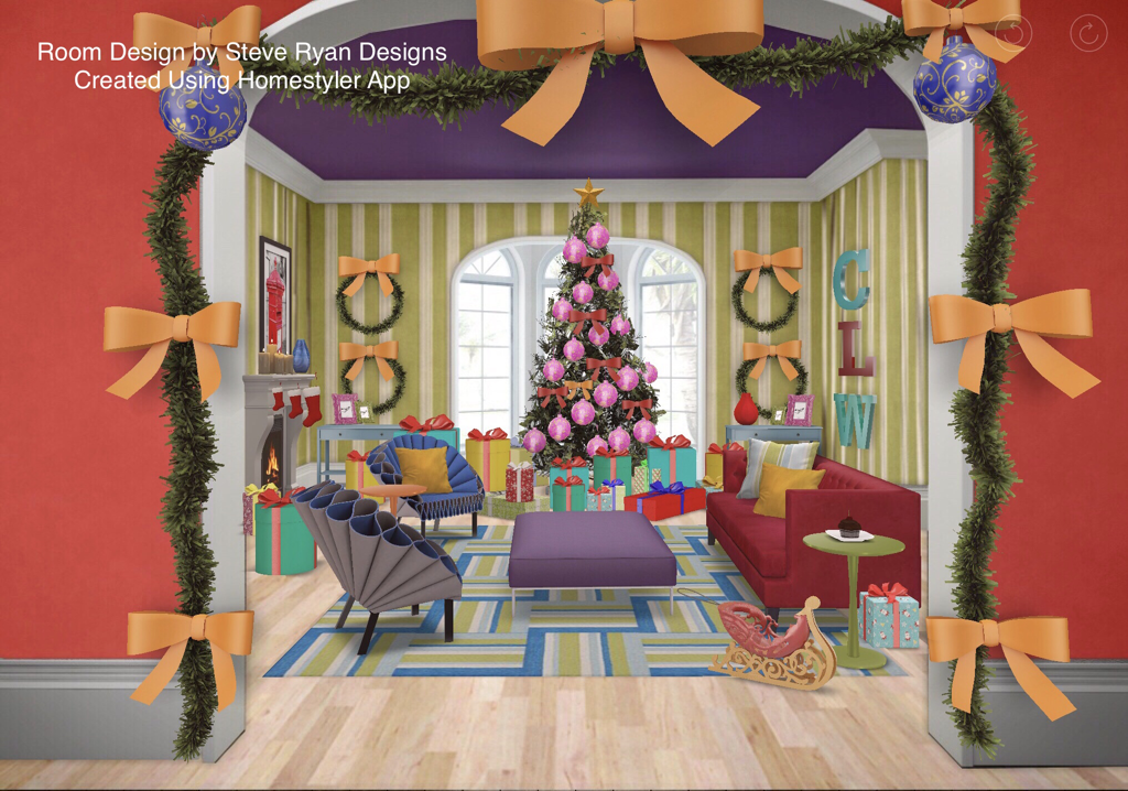
So those are my three Tips for the New Year. I’ve talked before about the energy of the Home and how good Design and changes affect you, your emotional state and how that can spill over into other aspects of your life in a positive way. So consider doing one or all of these and see what changes occur in your life throughout the year as a result. This might also be the time of year when you’re considering a larger home project like a renovation so you might want to look into consulting with a Designer to help with that or set you up for success. Until next post, thanks for reading and striving to live The Well Designed Life. Steve So I know I said my previous post would be the last until the New Year but the Homestyler App I use to create digital renderings for these blogs has a little Christmas Contest going on and while I don’t usually enter contests unless there’s prize money involved, I threw together a couple of quick entries I wanted to share with you as I think they’re super fun. Consider it a Christmas Bonus. So, what I chose to do was create two distinct Xmas decorating looks based on classic Xmas movies. What I wanted you to see here is the bigger picture of how Design can really be effective. Designers can use their skills to create a mood, a feel, a look for their Clients and take inspiration from anywhere. So, using Homestyler’s own room templates and items from their catalogue only, here are my two Classic Holiday Movie Inspired Rooms. It’s A Wonderful RoomThis living room is inspired by George Bailey’s house in the 1946 film “It’s A Wonderful Life”. While maintaining the architecture and furniture style of the 1940s I’ve been able to create a very traditional salon in a middle class American home. The other clever thing I did was choose items that were Achromatic - or I adjusted their brightness to be shaded - to make the room appear to be black and white like the movie. I did not need to use a black and white filter on this image at all. It was done through deliberate choices of colour and furniture pieces. It’s a great example of how Designers use Colour Theory in their work. The Best Little Who-HouseMy second look is a different view of the same room but this time inspired by Cindy Lou Who’s house in the 1966 animated movie “How The Grinch Stole Christmas”. While still following the rules of good design (furniture layout, symmetry, scale & proportion), I’ve chosen to use the highly saturated primary and secondary colours on a grand scale that give the Movie its distinctive look. I’ve also worked in the over-the-top decorating and excessive presents for the Grinch to steal that feature in the movie. And again, everything here is from Homestyler’s own catalogue - even those weird blue chairs that look like coffee filters fit perfectly. This is a great example of how a Designer can use the full scope of their skills and training to create a Client’s space.
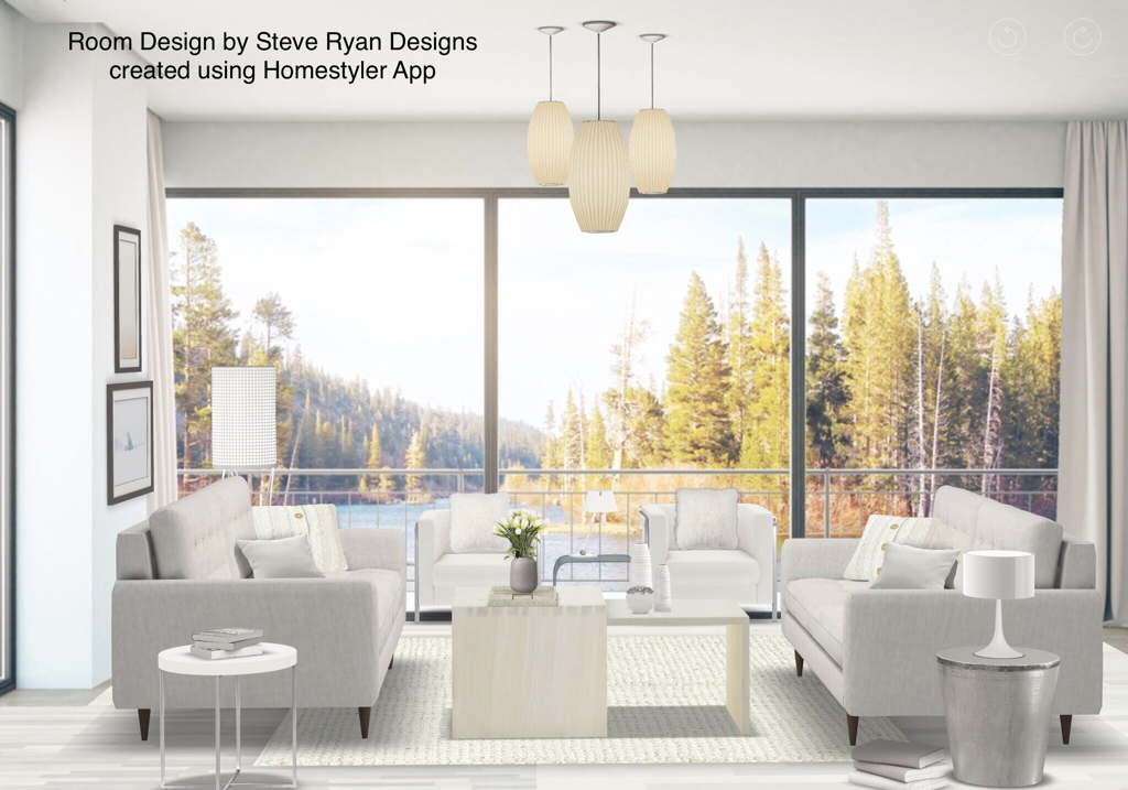
So this will definitely be my last blog post until the New Year. I hope you found it interesting and that it put you in a festive mood. I also hope it showed you the valuable services a Designer can provide. Happy Holidays Steve With Christmas fast approaching we’re about to be covered in a blanket of white so I thought this post I’d chat about covering your interior in White as well. White is absolutely one of the most popular hues with Designers and Clients alike. I suspect this is because it’s an incredibly complex colour even though it’s not really a colour. What makes white so complex is it’s wide variety of undertones. Some are warm (having a yellowy browny undertone) and some are cool (having a bluey grey-y undertone). There are also whites that have a hint of a colour in them that is basically a very tinted version of that colour and is warm or cool depending on that colour. Decorating with white means having to mix warm whites and cool whites. If you do all warm, it looks like a dirty white and if you use all cool, it looks really cold. A good way to do all White is a “Cookies&Cream” approach. This is where you mix cool white walls, furniture and chrome metallics with dark chocolate woods in your floors and case goods (see my earlier blog post “The Neutral Zone” for more). But what if you want ALL WHITE? Like a Nordic paradise or Superman’s Fortress of Solitude? Well this means you need to mix warm and cool whites to balance it all out. Like this: Here you can see an all white Interior mixing warm and cool whites. The walls have a cool blue undertone. The floors are a yellow undertone. Then I’ve mixed them throughout the soft furniture, accessories and case goods. The other way to add visual interest is by layering textures. You can see some tables are a lacquered finish, some show wood grain. The rug has a plush pile. The throw pillows are faux fur, linen and knitted. Even the sofa has button tufting and the floor lamp shade is textured. These all combine to make a great visually interesting look. A note about art: if you have a great view like this, keep your art simple and neutral because the view will be your art. If it’s less than stellar, consider using art dramatically to draw focus. If you choose the latter, be aware that if the art is coloured it will really stand out even if black and white. Be aware that you can use coloured art in an all white room if you like as it doesn’t necessarily have to be part of a room’s colour scheme
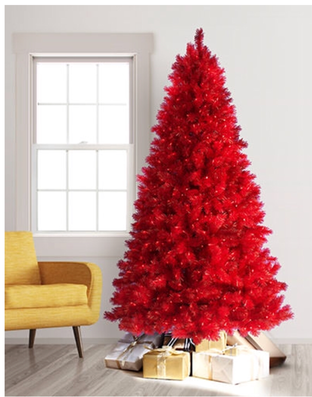
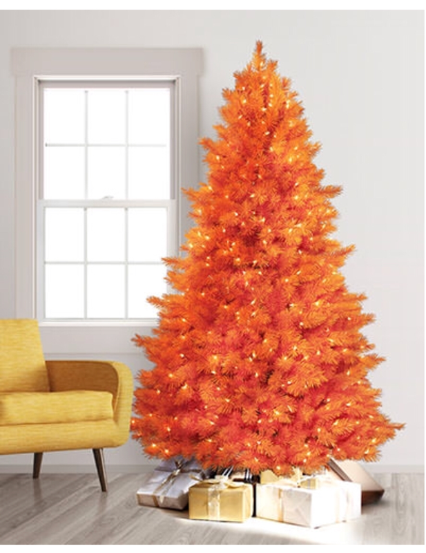
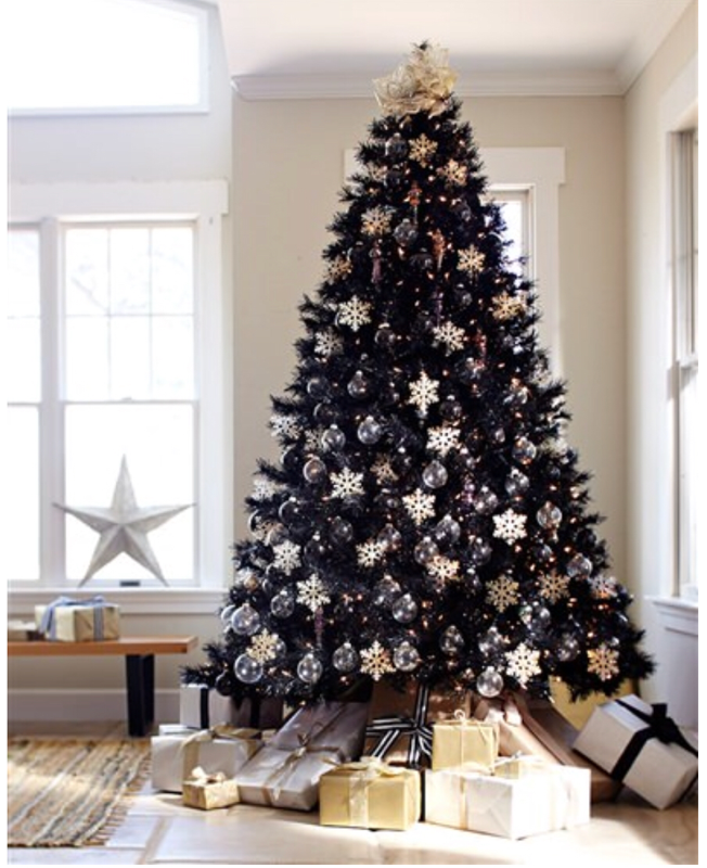
So there’s my advice if you want to create an all white interior. Of course, you can always hire a Designer to handle a room like this if it seems too daunting. We’re always here for you. Also, this is my final blog post for 2018 as I’ll be taking a couple of weeks for the Xmas holidays to spend with my family. Starting in 2019 I will likely only be doing a post bi-weekly or possibly once a month. I may be booking a new client with a time sensitive project I hope to land and make great and I’ve agreed to volunteer to help out with the Decorators & Designers Association of Canada’s (of which I am a proud member) annual awards gala in the Spring and there is some other volunteer work I’d like to start doing in the Toronto community. All of that will take up some of my time but it’s all part of The Well Designed Life I’ve created for myself and want for my Clients and everyone. Until 2019, have a great Holiday Season and thanks for reading Steve As the Holidays approach, everything becomes blanketed in lights and glitter. As a Designer this time of year fills me with delight - and dread - because while some people put up festive decorations, some people get so carried away they go full on tacky (I’m talking to you woman across the street from me who puts a up a full size tree in her studio apartment mid November and leaves it up until Easter!!). So this post I thought I’d give you three tips for amazing holiday decorating. 1) TREES If you’re going to put up a tree, why not consider doing something a little more interesting? Like COLOUR!! Consider getting a coloured tree like these ones from treetopia.com. They come in a rainbow of hues and neutrals that can really add some unconventional wow to your decor. What’s great about these is that their colour is part of the decoration so you can actually use less ornaments. Also if your interior is pretty neutral, you can get a real punch of colour. If you prefer a really sophisticated look go with white, silver or black! 2) Decorations Try and keep your ornaments to one simple colour theme like red/gold/green or silver/gold/white especially if you like to put up a lot of decorations. Having a lot of different coloured balls, ornaments and general seasonal items on your tree, mantle, bannister, chandelier, in bowls on the coffee table, etc can look really chaotic. If they are all part of the same colour family (1-3 colours is best) the eye will actually group them and will look more harmonious and unified. If you hate hanging countless balls in your tree, make a garland out of them using thin ribbon or fishing wire. Simply knot a large ornament, slide the others down in various sizes and knot the final one. Then you can just wrap it around the tree. It’s waaaay faster and looks great: 3) Outdoor Decorating This is the one that really turns neighbours into the Hatfields and the McCoys. If you love the Holidays well that’s great but don’t get so involved you lower the property value of your ‘hood. Case In Point - this actual House in my area: That is the kind of house a child eating clown would live in. This does not say ‘Happy Holidays’. It says ‘Come get your balloon, Georgie’. Yeeeesh. I suggest keeping it simple: outdoor LED lights in white. They’re clean, reflect beautifully off snow cover and actually help light your walkway, front steps, porch making it safer on potentially slippery surfaces. Draw a welcoming focus to your door with a wreath and a nice urn with some greenery, ornaments and lights. And lose the strings of lights going around your rooftops and windows, etc. They’re a pain in the neck to put up and take down. If you really want a big light show that’s way easier you can buy a light with a gobo screen you plug in and set on your front lawn that will project moving lights onto the front of your house in variety of things like snowflakes, stars etc. And, in the name of all that is holy, do not put one of those giant inflatable Santas or Frostys on the front lawn. If you don’t keep them running 24/7 there’ll be a dead, deflated Xmas icon in front of your house traumatizing children and carollers alike: That doesn’t exactly scream ‘Christmas Spirit’, now does it???
So I hope this has given you some ideas for a Well Designed Holiday and remember, if the season is getting a bit overwhelming for you in “A Bad Moms Christmas” kinda way, you can always hire a Designer to decorate your house for you. We’re always here to help so don’t hesitate to reach out to us. Thanks for reading. Steve |








 RSS Feed