|
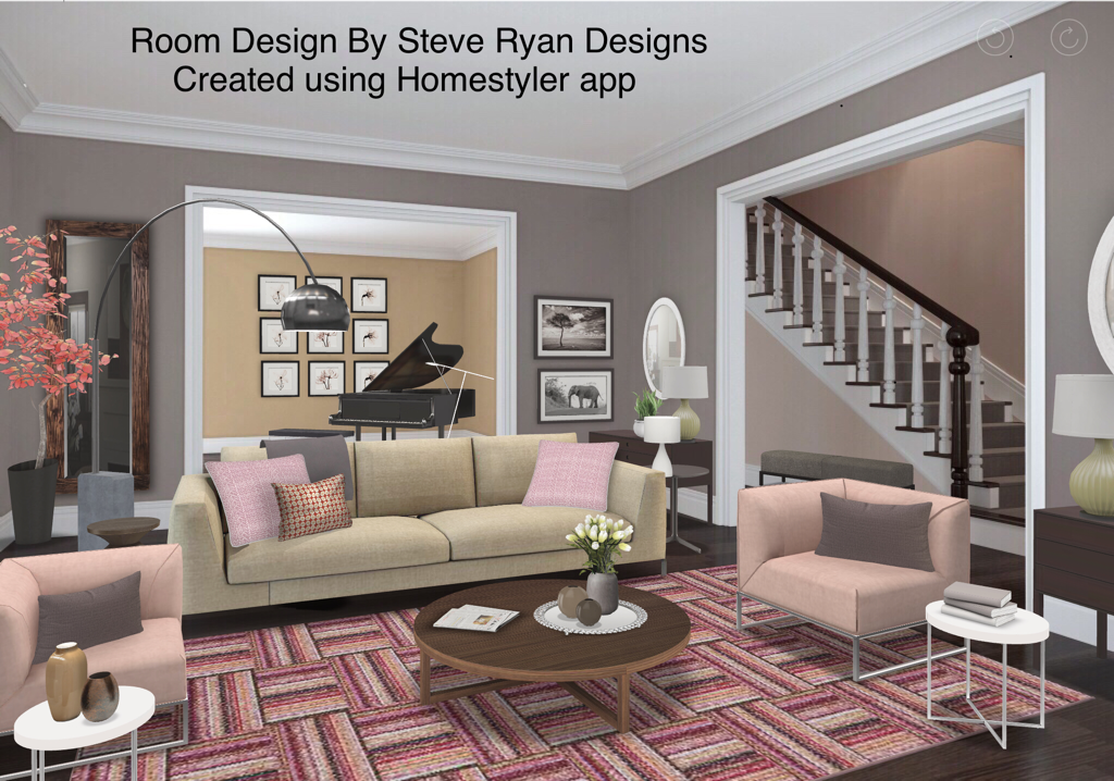
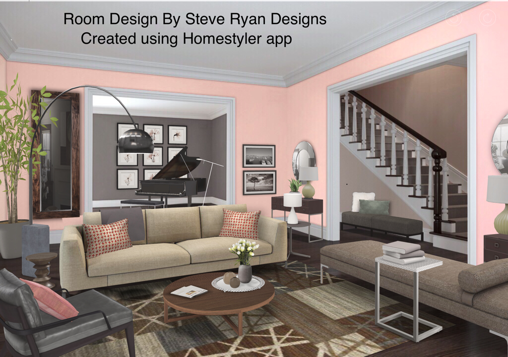
Of all the colours, I have to say that Pink is one of most polarizing and unfairly so. There is no pink on the Colour Wheel. It is simply red that’s been tinted with white. What’s weird is, if you mix blue and white you get light blue. If you mix yellow and white, you get light yellow. But add white to red and you get this totally separate entity that Western culture has attached a butt load of gender stereotypes to (and slapped on the packaging to every female product in Shoppers). Pink is seen as girly (not just feminine or softer - female AND under the age of ten) but it’s really all just in our heads. So I thought this post I’d make like lover-of-pink Taylor Swift and show you how to shake it off by designing a room using PINK without the end result looking feminine or juvenile. Let’s take a look: Here’s a Living Room in a house where I’ve used pink as the main colour. I think the best way to combat the feminine stereotype is to balance it with Neutrals like crisp white, tan and grey. These are great balances because the grey and white are cool tones for the warm pinks. Tan and pink also look great because tan is tinted brown (derived from orange) so you basically have red and orange which is an analogous colour scheme). Tan&Pink will be warmer together so definitely use some cool whites to cool it down. The other way I’ve balanced the feminine feel here is using straight lines and 45 degree angles against the soft feel of pink. This means the furniture is clean lined, square armed, the mouldings are also very squared. Even the rug pattern has these harder angles. Using Neutrals balance the pink and the hard corners cut down on the softness you’d feel on furniture with rounded edges and arms. Also I’ve kept the pinks here very pale. A more saturated bubble gum pink might be a bit harder to deal with but this light pink is easy to handle. Furthermore, the furniture is modern and clean lined with lots of leg showing. This is also a bit more masculine in feel to counter the preconceived notions of femininity around pink. If the furniture was skirted or slip covered, it would feel more feminine and mixed with pink would definitely come across as girly. I’ve also kept the patterns cleaner: solids, stripes, geometric, overall patterns (you’ll remember reading about those in my recent blog on Bachelor Pads) and kept away from florals and damasks. Let’s look at pink on a larger scale. Here we’ve used a very soft pink on the walls and a few small accessories. We’ve kept the furniture Neutral again with clean, straight lines and added some grey leather in the armchair to balance out the pink. But because there’s so much pink on the walls, I’ve kept it to a minimum elsewhere since having it on such a large scale can get very overpowering if it’s not used in smaller doses elsewhere. I also recommend going with a soft blush pink if you’re planning on using it on the walls. Going with something more saturated can feel like you’re living in a bubblegum factory. Nobody wants that.
I think both of these looks are very liveable. They’re clean and modern but not the least bit juvenile. They’ll especially look great at night when the lighting levels are lower too. So don’t be afraid to Think Pink. And remember, if this is something you’re thinking of doing but are nervous, you can always contact us to help. Until next time, thanks for striving to live the Well Designed Life. Steve
7 Comments
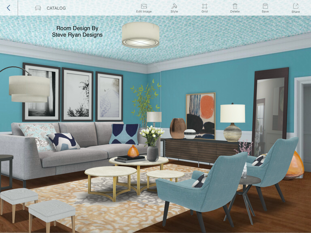
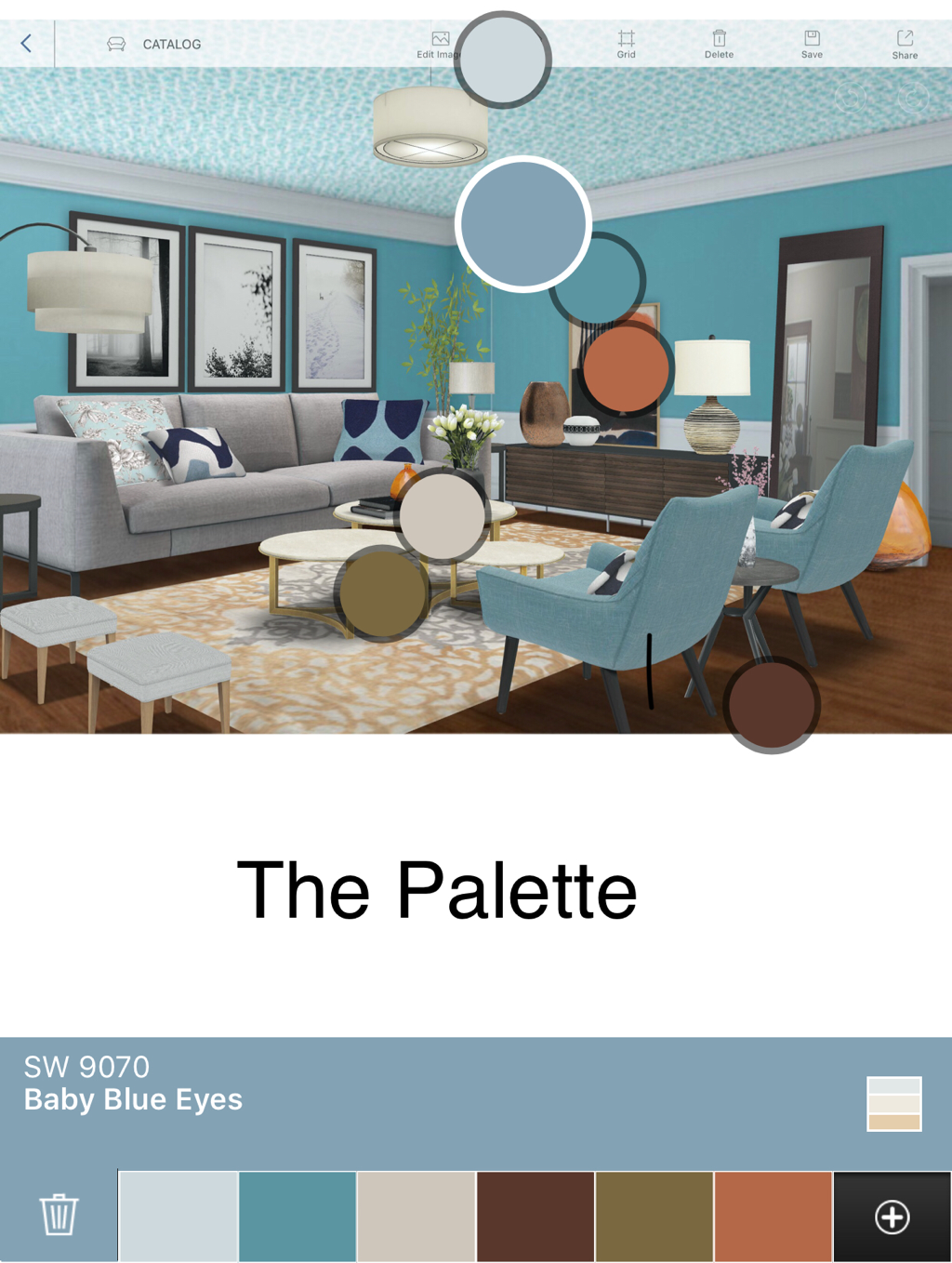
Hi everyone. With Smartphones taking over, I thought this post I’d give you my top three picks for apps that can help you with Interior Design. Whether you’re a professional or enthusiast there are lots of cool apps you can download to your phone that can really help you in designing your space. Here are my three favourites HomestylerI’ve gotten a lot of feedback on my blog posts about the digital rooms I create to illustrate my Design Tips from both readers and other Designers. I use a great free app called Homestyler. It has a huge catalogue of furniture/materials/finishes, etc you can superimpose on pics of rooms provided or your own. For the professional, you can do fast images to give a Client an idea of your project plans. You can even log on to their website and create advanced floor plans with items from their catalogue or ones you’ve downloaded which can then switch to 3D images you can take your Clients through. If you’re an enthusiast, that’s likely more than you’ll need but you can use the app to see how to restyle your rooms. For example, let’s say you’re considering buying a new sofa for your neutral room in red and fear it’s a mistake. You can snap a pic of your room, choose a red sofa from their catalogue and drag it on top of your existing one to see how it’ll look without having to buy. There’s even an online community you can share your designs and see others for inspiration. I’m happy to say, I’m very popular on it. You can also just play around to try colour schemes or looks that can eventually inspire your real space. Here’s an example of a room I designed where I simply wanted to explore decorating with teal: I liked the end result and didn’t have to lift a paint roller or piece of furniture. I used this app when I was in Design School and still use it today for renderings of Client projects. It takes way less time than hand drawn, coloured perspective renderings which saves my Clients money on billable hours. ColorSnapThe wonderful paint company Sherwin-Williams has a fantastic app for the colour lover called ColorSnap. Ever thought about changing your wall colour but just couldn’t decide? You can snap a pic of your room, choose any colour from their 100s of choices and it will photoshop the colour onto your walls in a snap. It can also colour match images you use from your camera roll or Pinterest. So if you saw a room you’d love to recreate, snap a pic and it will find the hue in its roster that matches. It can also select several hues from a picture and create a palette for you. Here’s an example using the Homestyler image used above: You’ll noticed it picked the teal wall colour and matched it perfectly. You can also do this with something as simple as a throw cushion. It’ll pull colours from the fabric you can then use in paint, upholstered goods, draperies, etc. You can also pick a colour and it will show you what it will look like in a neutral furnished room (as seen in my earlier blog “Orange Is The New Black”) both during the day and at night. This is important because colour changes depending on the amount of natural daylight or lumens reflecting it. Also if you’re mostly home at night, you want the wall colour to be one you love then, not during daylight hours when you’re not around to see it. Plus it will give you a coordinating palette to go with the colour you’re considering. It’s easy, super helpful and free!! JiffyOk so this isn’t quite a design app but it is an amazing tool for both the Design Professional and the homeowner. In a nutshell, Jiffy is to handymen what Uber is to drivers. If you live in Toronto, Ottawa or Boston you download the app and create a profile putting a credit card on file. If you need a licensed insured tradesperson to fix something, you make a request, pick three time slots that best suit you and they arrive to do the job. They bill Jiffy who bills your credit card and then they pay the service provider. You don’t even need to have cash on hand. You can literally order a licenced tradesperson to come to you like a pizza. You can even rate them like an Uber driver. It’s a super easy way to get little projects done without worrying about who’s doing the work.
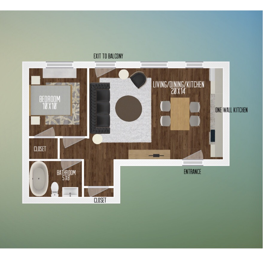
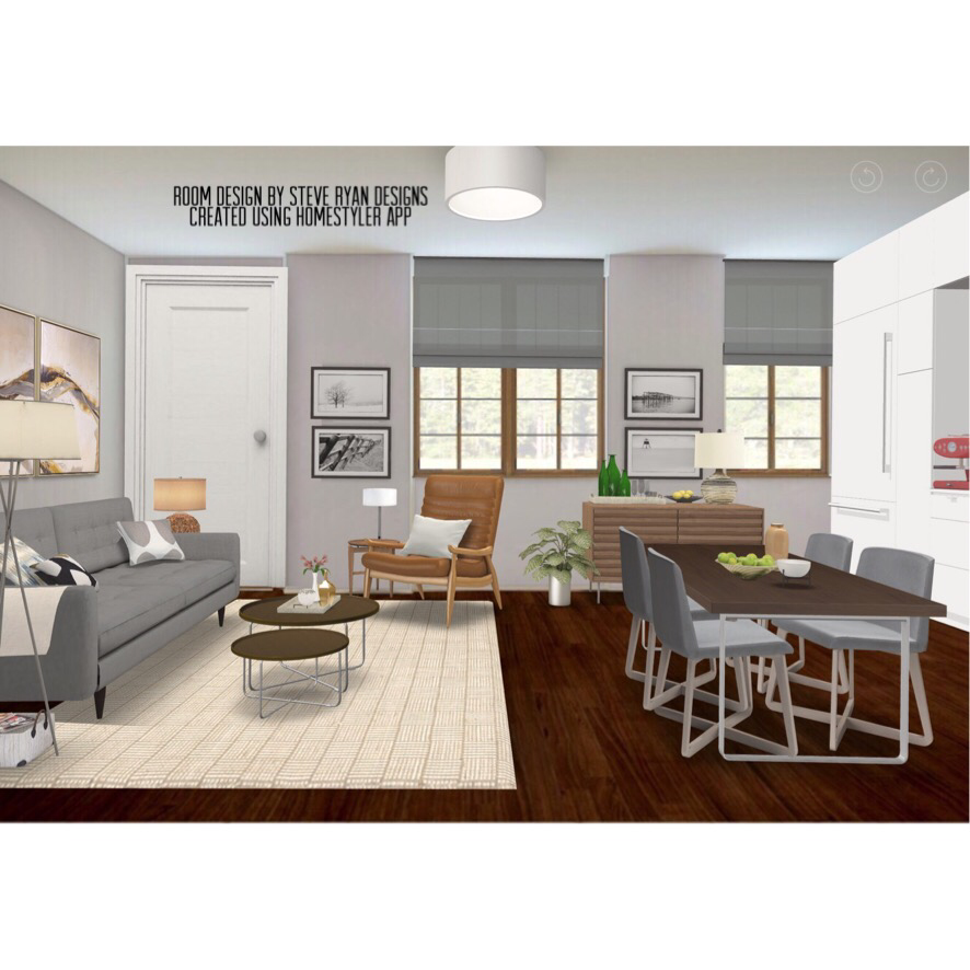
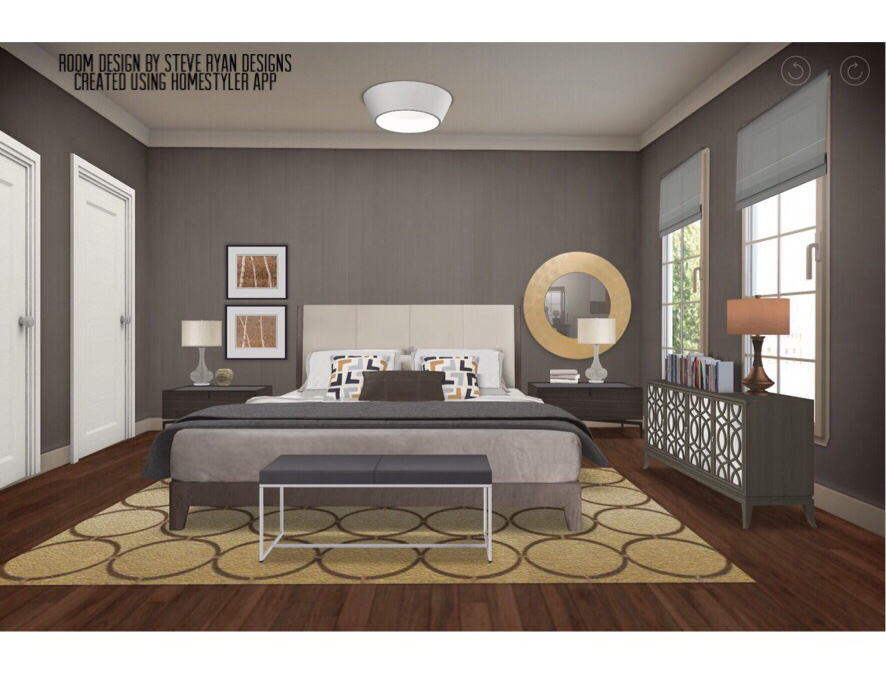
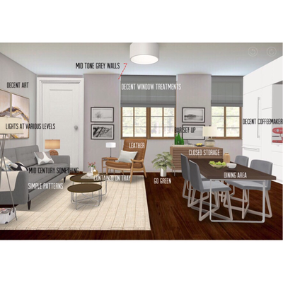
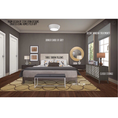
So those are my three favourite smartphone tools that anyone can use to help achieve the Well Designed Life I am always talking about. Of course, nothing beats hiring a Professional so don’t hesitate to contact us if you need a little extra help with your space. Until next time, thanks for reading Steve After last week’s post about how your space reflects yourself and that improving it can improve your life, I’d like to focus on a group that really needs to learn it : Single Guys. I don’t know what is up with that group but, gay or straight, you’d be hard pressed to find me a Horror movie scarier than a bachelor’s apartment. It used to be guys lived like Donald on ‘That Girl’ in a clean lined, tailored space with a kitchenette and fully stocked bar. Now they live like Jodie Foster in ‘Nell’. And I know because I’ve been in many of them. From a Nautilus machine instead of a dining table to garbage bags taped up on the bedroom window in lieu of curtains, I have seen some nonsense. So as a Designer and bachelor myself, I thought I’d give my Top Twelve Tips for creating a stylish guy’s apartment. The Floor PlanSo this is a typical apartment or condo you’d find in an urban centre. About 450sq ft with a Living/Dining/One Wall Kitchen, Bedroom, Bathroom, some closets and windows on one side. It’s small but with big potential. Let’s look at the Designs for the Main Living Space and Bedroom. Just the Tips:Palette A great colour palette for men is camel and grey (see my earlier blog “The Neutral Zone” for more). Your ceilings, trims and doors are likely white so leave them and paint the main space a mid tone grey or beige and a darker shade of that colour in the bedroom. It’s nice and harmonious and during the day will look bright and at night darker and moodier. Once painting is done you can move on to furniture (that doesn’t all come from one store). This means spending money on more than just a big ass TV/Entertainment Unit. I hate to break it to you but you need a place to sit down more than you need a television the size of a Drive-In Movie screen. Mid-Century Something Whether vintage or a modern reproduction, mid century modern furniture is clean, contemporary and manly in feel. Spurred on by the success of “Mad Men” you’ll have no trouble finding something. From Ikea to Kare to Elte, it’s everywhere. I’d recommend a couch in this style. Leather Something in leather is also great for a guy. I recommend using it on the couch, an armchair or upholstered bed frame or headboard. It’s great to the touch and durable against wear and spills and stains. Eat In You can’t just eat off the coffee table (which should be an actual piece of furniture and not a cardboard box turned upside down or milk crates). In my design above, I’ve floated it between the kitchen and living room. This gives you double duty as the table can be used as another work space for cooking or a desk if you have to bring some work home. Store It A credenza or other closed storage unit is your best friend. You can put your tv and components on it while hiding your DVDs inside. In the dining area, you can store extra dishes inside and set up a bar on top for when you have people over. Light The Way Those boring ceiling lights aren’t enough. You need to have lamps with bulbs at different heights. This gives the lighting a layered look and creates mood. Keep It Simple, Stupid Keep your patterns and accessories to a minimum. Two square and one horizontal throw pillows on your couch and bed are perfect. Keep them in your neutral palette with simple patterns : solids, stripes, geometrics, overall patterns. Get some decent art too. It can be as easy as taking some pics of architecture or nature, changing them to black and white or sepia and having them printed up and framed. Go Green Whether real or impressive faux-tanical, having a plant or some flowers shows you’re totally adulting. Contain Yourself Reduce the look of clutter by putting or grouping things in containers or on a tray. A nice lidded box on your coffee table can hide your remote when not in use and putting kitchen utensils in a container or items on a tray keeps them tidier. Throw Some Shade Flags and garbage bags are not curtains! You can buy curtain panels and a rod or roller blinds in lots of places for next to nothing. When closed, curtains should not look like bedsheets on a line. If you’re buying a pair of pre-made panels buy two sets and hang one set per side so they still look full when pulled over. Book It Iconic film director John Waters once said “If you go home with someone, and they don’t have any books, don’t f*ck them”. I really can’t add to that other than they also make great styling accessories or can be stacked under a too short lamp to change its height. Have some. Cafe-Oh-Lay Have a decent coffeemaker. When I graduated from Design School I gifted myself with a very sassy cappuccino machine. If you’re tight on counter space, get a French Press and an inexpensive grinder that can be stored in a cupboard. You’ll thank me every morning especially if last night’s dinner date turns into this morning’s breakfast companion. Keep It CLEAN A study in 2011, reported by NBC News, found that the average bachelor pad has fifteen times more germs and bacteria than the average bachelorette. 70% of guy’s coffee tables contained traces of animal feces - likely from putting their feet up while wearing shoes. This is just gross. You need to have a regular cleaning schedule in addition to your day to day tidying up of sweeping the kitchen floor and washing the dishes. The night before your weekend is prime time to do this. Clean your kitchen, bathroom, dust and vacuum. If you’re generally tidy, this will only take an hour to an hour and a half and then you’ll have a clean place for the weekend and your weekend time free to do what you like. Also, remember there are two types of people: those who make their bed every day - and monsters. Now let’s look at all twelve tips being used in the design: So there you have it. Twelve super easy tips that any guy can handle to go from slob to sophisticated. Of course, these are only a few of the many tips Designers have to create a stylish home for any Singleton. Personally I love doing men’s apartments because I know from my own how great it is to live in a slick bachelor pad. Don’t hesitate to contact us if you’d like help designing yours or you’d want to hire us for a consultation to improve your space.
Until next time, thanks for reading and striving to live the Well Designed Life. Steve. So in my last post I talked about affordable upgrades to your rental and touched on my mantra of ‘The Well Designed Life’. I thought this post I’d expand a bit more on what I mean by that and why I, and other Designers, sell it and want you to have it.
When I talk about The Well Designed Life I basically mean, for lack of a better phrase, “The Subtle Art Of Giving A Sh!t”. As a Designer I believe that everyone deserves to live in a beautiful and functional space. Ideally one they paid me to give to them (I know I can be frank with you as we’re old friends). But a beautiful space goes deeper than just aesthetics. Your home is a reflection of who you are. In dream interpretation, homes actually represent your self. And yours gives all the dirt on you, your emotional state and how you view yourself in the world better than any gossipy High School Mean Girl. I have yet to meet anyone, be they Client or other, whose pad didn’t tell me all their secrets. I’m like the House Whisperer (I know because my friends fall into 2 camps: the “No Way Are We Letting You See This” camp and the “Come Over And Bring Your Paint Fandeck With You” camp). From the crammed closets to the past-their-prime furnishings to the books on your shelf, I’ve heard all about you and I heard it from the chatty roommate you call your home. The good news is, you’re one of the ones who gives a sh!t. I know because you’re here reading this so you’re interested in improving your space because you give a sh!t. Wanting to improve your space means you’re growing and changing as a person (as you should be) and your space is part of that new mindset. Reading my Design Tips on these blogs is a great way to get ideas to upgrade your surroundings. Hiring a Designer to help with your space, even if only a consultation is all you can afford is even better because as you’re changing, your tastes are changing too and that can feel overwhelming. The cold, hard truth is you’re in a relationship with your home. If you were dating someone who wasn’t meeting your needs or just plain wasn’t that great to you, you’d (hopefully) do something about it. Your home is the same. If it isn't treating you right, you need to make some changes and you might need a little professional help. I realize I’m encouraging you to get some professional help because I’m a professional who gets paid to help and I like being employed but it’s more than that. Improving your space really improves your life. Like that time you dumped that loser and changed your hair colour to show them you were not going back, changing up your space opens you up to a whole new way of living. Cooking meals in a kitchen that’s well planned out makes your cooking better and easier. Before you know it, you’re trying new recipes or taking a fancy cake baking class or just eating healthier. See? Your life got an upgrade. Working long hours is draining but coming home to a sweet abode brightens your mood. Upgrade. Having a nice place makes you wanna have people over for brunches and Holiday fetes and Games Nights and will make your disapproving Mother-In-Law just a weeeee bit jealous like you secretly want her to feel as payback for that time she critiqued your roast. Upgrade, upgrade, upgrade, upgrade. You get the picture. This is the “Well Designed Life” of which I speak. Improving your surroundings improves your vibe and your vibe attracts your tribe. When you upgrade your space your vibe vibes faster so everything raises to meet that. Suddenly you’re eating better, dressing nicer, socializing, trying new things, getting out of your comfort zone, ditching that toxic friend or dumping that idiot who just plain isn’t good enough for you because you now know you’ll be better off without them and don’t want them to be part of your E! True Hollywood Story. You know, generally giving a sh!t about things - or at least a bigger sh!t than you ever gave about those things before. While I don’t suffer from depression, like everyone my life has its ups and downs. I always know when I’m in a little rut because my place tells me with the piling up of laundry and dust bunnies. This may seem trite but when faced with that, I break the blues by cleaning up and/or rearranging things. When everything is shiny, wrinkle free and the bathroom smells like a swimming pool in a hospital, I start to snap out of it. When I look around at my fabulous Designer digs I’m reminded of how good I generally have it. I feel lucky. Then I feel grateful to be so lucky and gratitude is a gateway drug that takes me straight outta Funkytown. The Well Designed Life isn’t just pretty to look at, it’s good for the Soul. So I hope reading this gives you some insight on the value Designers have in this world. We’re part Decorator, part Psychologist and part Magician because we don’t just deal with how your space looks, but also how it makes you feel. Thanks for reading, keep striving to live The Well Designed Life and don’t hesitate to contact us if you’d like to upgrade your space - and your life! Remember, everyone deserves to live in a beautiful home. So do you. Steve A few days ago I bumped into a talented actress friend who lives in my hood. We were both out running errands and passed each other at the intersection. I was wearing a dapper little outfit carrying my reusable grocery bag with kale poking out and she was wearing yoga pants and toque as she flitted from ballet class to the subway. As we passed she flashed a big smile and said “you don’t even own a pair of sweat pants, do you?” . Well, she was right and hardly the first to say this to me. The reason for my general fabulosity is my company Design Mantra I bring up in every blog post: Keep Striving to Live the Well Designed Life. It’s important that I walk the walk. How can I tell a Client they simply must have $5000 of custom draperies if I live in a hovel dressed like a professional skateboarder who can’t get a sponsor? It got me thinking about what the Well Designed Life means to me and what I want for Clients and readers. It’s my belief that everyone deserves to live in a beautiful home that reflects them, even people who (think) they can’t afford it. When I first moved out on my own, I was always gussying up apartments into showrooms. It’s the start of how I got here. So I thought this post I’d give some budget savvy advice to all you renters or cash strapped owners who want to improve their home without going neck deep into debt. Here are a few of my top tips to improve your space on a budget. FURNITURE
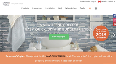
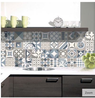
TILESIf you’ve got a kitchen or bathroom with an ugly, or no, backsplash one of the best things for you is Smart Tiles. Smart Tiles are peel and stick sheets of gel filled 3D Tiles you can cut with scissors and stick on your wall or on top of existing tiles. Super fast. Super easy. And adhere until you remove them with the heat of a hairdryer. They can even go behind a stove (but not in a shower as the steam dissolves the glue). I’ve used these myself. They look amazing, took little effort or time to install and you can’t tell they’re not the real thing. You can easily do a backsplash in a kitchen for about $150 installed in about an hour and they have very updated, on trend patterns like subway tile, herringbone, circles, etc. Available on their website or at many hardware stores. PAINTPaint is without a doubt the best tool in anyone’s decorating arsenal. It’s really inexpensive and has the most impact for your dollar. Not only can you paint your walls but you can update an old piece of furniture or even your crappy kitchen cupboards (check with your landlord first if you rent). Be sure to speak to your paint professional before you start. 80% of a great paint job is proper prep work be it taping, sanding, cleaning. The staff at your favourite paint store can advise you on all of that and what paints will work best for your job.
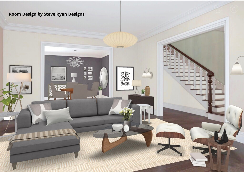
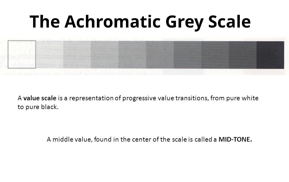
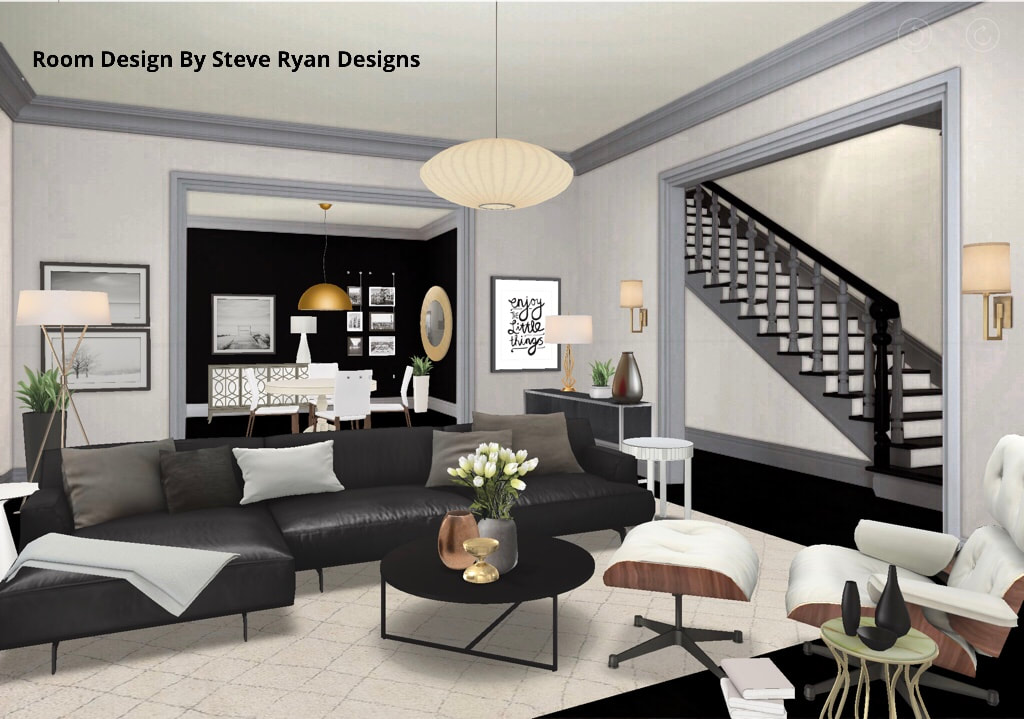
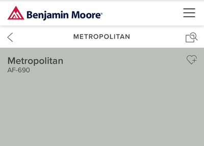
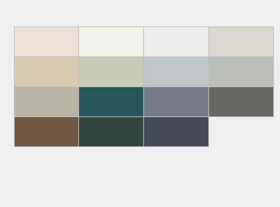
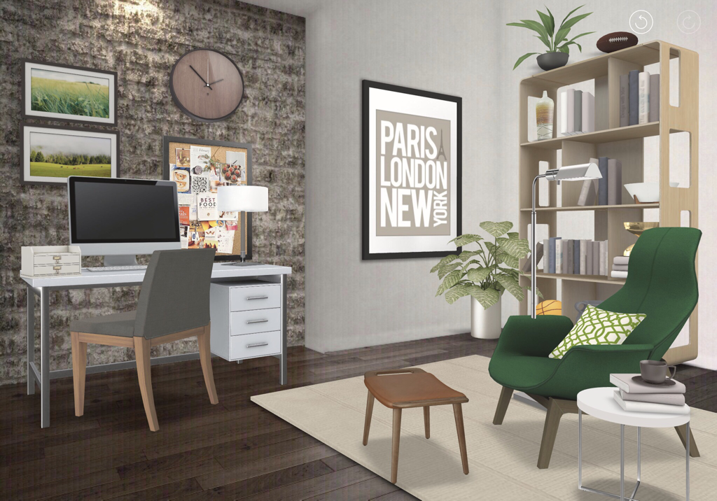
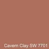
So I hope that gives you some inspiration to create the home you deserve no matter what stage of ownership you’re in. These are just a few of the creative solutions Designers have, so don’t be afraid to contact us if you need a little help. Thanks for reading and check back for more blog posts. Until then, keep striving to live the Well Designed Life. Steve Hi Everyone! Since my last few posts have been about colour and how to use it, I thought this time I’d give you a lesson in working with Neutrals and the Achromatic Colour Scheme. Neutral interiors seem to be the favourite of sooooo many people. They fill the pages of every Design Porn magazine; some Designers have made entire careers out of using only them; I heard your collective woohooery when you read it’d be today’s subject. I think there are two reasons why people love neutral interiors. 1) they’re very calming and harmonious and 2) they’re hard to screw up. While the former is true, the latter is a little trickier. So I thought I’d do another of my oh-so-popular “One Room, Two Looks” showing the same space done in Neutrals and using the Achromatic Grey Scale. Never let it be said I don’t give my audience what they want. When working with Neutrals you’re not using any colour, only black, white, grey, brown, beige, tan, etcetera. What you need to understand is black, white, grey are “cool” colours and brown, beige, tan are “warm” colours. So when using them you want to have a balance of warm and cool because it’s not only more harmonious, our brain actually likes to see it. So here’s a Transitional Living/Dining Space to illustrate my point: Room Design Created Using HOMESTYLER AppHere you can see that I’ve balanced the grey walls and white trim with some beige walls and warm woods in the flooring, case goods and rug. The browns and beiges are warm because they’re a broken hue derived from orange which is a warm colour. By mixing them with the greys, blacks and whites, they balance each other out. In addition, I’ve mixed the metals here (yes, you can) using brass and chromes together as they’re warm and cool, respectively. This room is very harmonious and this look is one so many want to have. You’ve seen it in a million Design magazines and it’s a look I get asked about a lot - I can’t lie, it kinda looks like my own parents’ house (Hi Mom & Dad). Now we’ll look at the same room in the Achromatic Colour Scheme. Using the Achromatic Colour Scheme means you’re layering black, white and shades of grey as can be seen in the Achromatic Grey Scale: So let’s have a look at the same room done using only black, white and greys. This is the scheme that’s trickier because, without the warm tones, how do you achieve that balance?? Let’s look: Room Design Created Using HOMESTYLER AppSo what you’ll notice here is while the room is still harmonious, it’s much more dramatic. This is because of the stark contrasts going on. The conflict of black and white gives this room a bit more edge. The other thing to notice is without the warmth of the brown tones the room feels colder and needs something else to warm it up. Cue the Heavy Metal. I achieved that by bringing in warm metallics only here in the accessories. I used golds, coppers and bronzes to achieve the temperature balance. Metallics don’t really have a hue. They take their cues from what’s around them. In all that achromatic surrounding they appear yellow, orange and brown - all warm hues. If you’re going to go with an Achromatic Colour Scheme like this one, you definitely need warm metals or your room will feel colder than a virgin on Prom Night. So I hope this has given you some insight on navigating the Neutral Zone. It is a popular look and fairly easy to achieve if you follow the rules of design. Be sure to check back with me for more posts. Also, feel free to leave comments on what you’ve read here or if there’s something you’d like to see a future blog posts about. And don’t hesitate to reach out to us if you’re looking for help with your home. Thanks for reading and striving to live the Well Designed Life. Steve Hi Everyone and thanks for checking back with me. My last couple of posts have dealt with colour, Colour Schemes and how to use it effectively in your interiors. Today I thought I’d go off on a little Colour Tangent and talk about two wonderful paint companies’ “Colour of the Year 2019” selections that have just been announced. It’s a very exciting time of year for us Designers when this happens - it’s not like “The Oscars” exciting but it’s close. Like “The People’s Choice Awards” exciting. Anyhoooo, two renowned paint companies - Benjamin Moore and Sherwin Williams - have just announced their selections for 2019 and I thought we’d talk about it. First of all, I like both of these companies and will give them equal time in this post. Asking me to choose between them is like asking me to choose between pie and cake or pick my favourite episode of “The Partridge Family”. You just can’t do it. What is great is that they’ve both picked very different colours to showcase for 2019 which I hope will make for a nifty Design experiment on this post. Now, you’ve probably heard about this *Colour of the Year* business from watching design enthusiast shows like Cityline or Marilyn Denis and wondered how these selections happen. Basically, these companies have a think tank of smarty pants (some of whom I even know and spoke to about this so I got the skinny straight from the source) who analyze trends and influences such as fashion, decor, entertainment, political climates, the state of affairs, etc. and find a colour in their existing fan decks they think best represents those things and how it will move us forward. The companies have several higher ups around the world who get together, present their findings, and look for common threads to come to their final decision. Surprise! The CotY is not a NEW colour they create - they narrow it down from their 1000s of hues. Also, it isn’t just some marketing ploy to boost sales or some Anna Wintouresque CEO simply pointing to something on a whim. They spend months researching on the global level to make their choice. Along with the CotY, they suggest a palette of hues and trend colours as well as textile choices you can use to combine a trendy look. This might all seem very confusing for you in terms of what you should be doing with all the suggestions they give you. So, I thought it would be fun - and demystifying - to do another “1 Room, 2 Looks” experiment where I design the same Den using each of their respective CotY and combination suggestions to interpret two distinctive looks. Let’s begin! Benjamin Moore Colour of the Year: Metropolitan AF-690So here is Benjamin Moore’s choice: Metropolitan- a cool silvery Grey they suggest pairing with layered greys, neutrals, greens and crisp whites. They also suggest shiny metallics for a clean, modern and sophisticated feel. So here’s the CotY and coordinating palette: So, keeping in mind we’re using Metropolitan with some selections from the Colour Trend palette and shiny metals to create a sophisticated Den as suggested by the creatives at BM, the look I Designed is this: Room Design By Steve Ryan Designs - Created Using HOMESTYLER AppSo you can see, I’ve combined Metropolitan with greys, tans, whites, chromes and hunter green to create a Den that is very sophisticated and contemporary. Also, while the CotY is the wall colour, the other trend colours appear in the fabrics, textiles, and case goods - and I didn’t pick all of them - I just took some suggestions and pulled the look together. Sherwin Williams Colour of the Year: Cavern Clay SW 7701Sherwin-Williams picked Cavern Clay as their CotY. It’s an earthy, orangey brown similar to a terracotta pot. It’s much warmer and rustic - almost desert inspired. They suggest pairing it with off whites, dark browns, tans and blue-greys : They also suggest pairing it with rustic elements like raw/heavy woods, leather and natural fibres. So I took all those suggestions and interpreted them into this Den: Room Design By Steve Ryan Designs - Created Using HOMESTYLER AppYou can see that this room is cozy and much more rustic than the previous with its dark woods, wrought iron metals and leather. You’ll also note, the furniture layout, floors/exposed brick stay the same. I’ve only changed the wall colour and combined them with the colours and textures each company suggested to achieve these two very different looks. Let’s see them in a side by side comparison: So there’s a few things I want you to notice here. While I put the CofYs on the walls of both rooms, you don’t have to. You can do a focal wall, paint only your doors, use a tinted or shaded version or use it as a fabric or textile colour. Also, I used the suggestions each company made and my rooms came out exactly like they predicted. The Benjamin Moore room looks sleek and contemporary (like they say their CotY is) and the Sherwin Williams room is warm and rustic (like they said their CotY is). I hope this gave you some guidance on how to interpret suggestions and design trends for your Interiors and cleared up some of the confusion you might have had. You can really take them as your jumping off point and play with them to best suit yourself. Paint is the cheapest, easiest way to transform your rooms with major impact so consider using one of these CotY in your own space. What’s great about both of these companies is they both offer lots of advice and insight on how to best use their products. If you’d like to learn more about the tools they have available, I suggest checking out their websites or visiting a location near you.
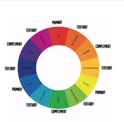
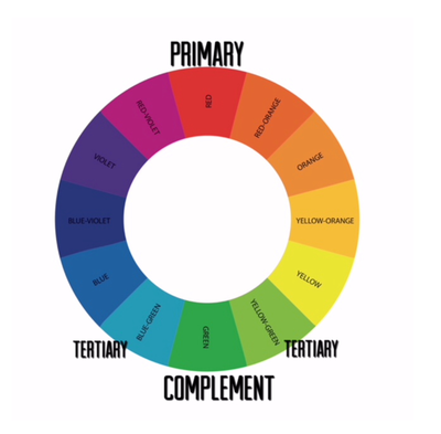
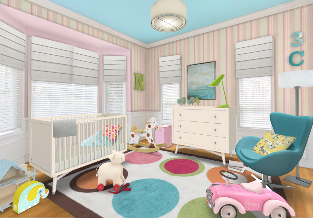
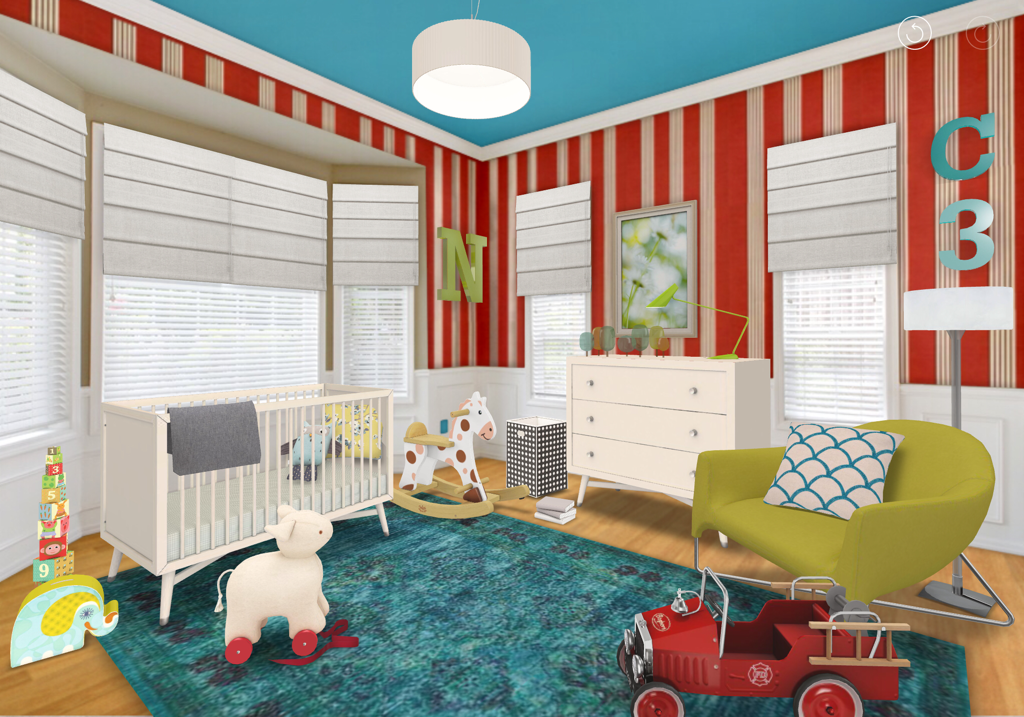
Thanks for reading and feel free to comment on what you’ve read here or if there’s something you’d like to see a future post on in the comments section. Until next post, keep striving to live the Well Designed Life. Steve Hi Everyone and thanks for checking back with me. In my last post, “One Singular Sensation”, I taught you about the Monochromatic Colour Scheme and showed you how to use it in your interiors. Well, now I feel confident that you’re ready to move on to a Colour Scheme a little more challenging: the Split Complementary. If you really want to embrace colour this is a great one for you and I think it’s super clever. Here’s how it works. In the spectrum of colour seen in the Colour Wheel there are three main colours (Red, Blue, Yellow) called “Primaries”. This is because they, along with black and white, cannot be created by any other colour. The Primaries all have “Complements” that fall directly across from them on the wheel (Green, Orange, Violet respectively). The Complements are derived from mixing a Primaries’ other two Primaries - ie Red’s complement is Green because it’s made from mixing equal parts of Blue and Yellow. Now, between the Complements there are “Tertiary’ colours that mix the Complements with a touch more of the other Primaries. This might be getting confusing so let me illustrate: (Tap Photos to Enlarge) So what’s cool about mixing a colour with its complement (known as a Complementary Colour Scheme) is they bring out the vibrancy of each other. In Split Complementary, we do they same thing but instead of using a colour’s complement, we use the *Tertiary* ones on either side (we split the Complement). How does that bring out the vibrancy, you ask? Because the Tertiaries have the Complement as their common hue. So if we pick Red, the Tertiaries are Blue-Green and Yellow-Green. Because they both contain Green, they bring the Green out in each other which plays off the Red thus bringing out the vibrancy in a three way orgy of colour! And it does it in a nifty and sophisticated way because it’s subtler than a Complementary Scheme which can be a bit more dramatic. So I thought I’d show you by designing a room in a Split Complementary Colour Scheme using that very palette of Red/Blue-Green/Yellow-Green and I’d thought I’d do something really fun. Soooooo I’m going to design a Nursery - one for a boy and one for a girl - using tints, tones and shades of that same Split Complementary palette and combine them to create two different looks. Here’s our palette: So now we have the palette, let’s put it to use in our two Nurseries for comparison: Girl’s Nursery designed by Steve Ryan Designs - Created Using HOMESTYLER AppHere you can see I’ve used tinted shades of the palette making them softer and more feminine. You can mix tones of the palette (ie the blue-greens or pinks could’ve been darker ) but you can seen how colourful the room looks because the three hues are playing off each other. I’ve also balanced all that colour with white so it doesn’t get too crazy for the eye. Boy’s Nusery designed by Steve Ryan Designs - Created Using HOMESTYLER AppIn the boy’s nursery you can see the hues still play off each other even though they’re more shaded. You’ll also notice I’ve made minimal changes in the rooms - most of the furniture is the same. I’ve really only used Colour to change the look and feel. In the girl’s room pink is more dominant and in the boy’s the blue-green is more dominant which completely changes how the rooms feel. However, both of these rooms have a real vibrancy and zing to them by using the Split Complementary scheme because of how the three hues play off each other. I realize that this is a bold use of colour but in a room like a Nursery, Laundry or Powder Room it makes for a really fun look. If you wanted to use a Split Complementary scheme in a subtler way, you could do it as easily as wallpapering a room or focal wall with wallpaper that contains the three hues but keep the rest of the room neutral with whites, greys, beiges and a few well placed accents of the three colours. Once again the amount of colour you use is up to you and your comfort level.
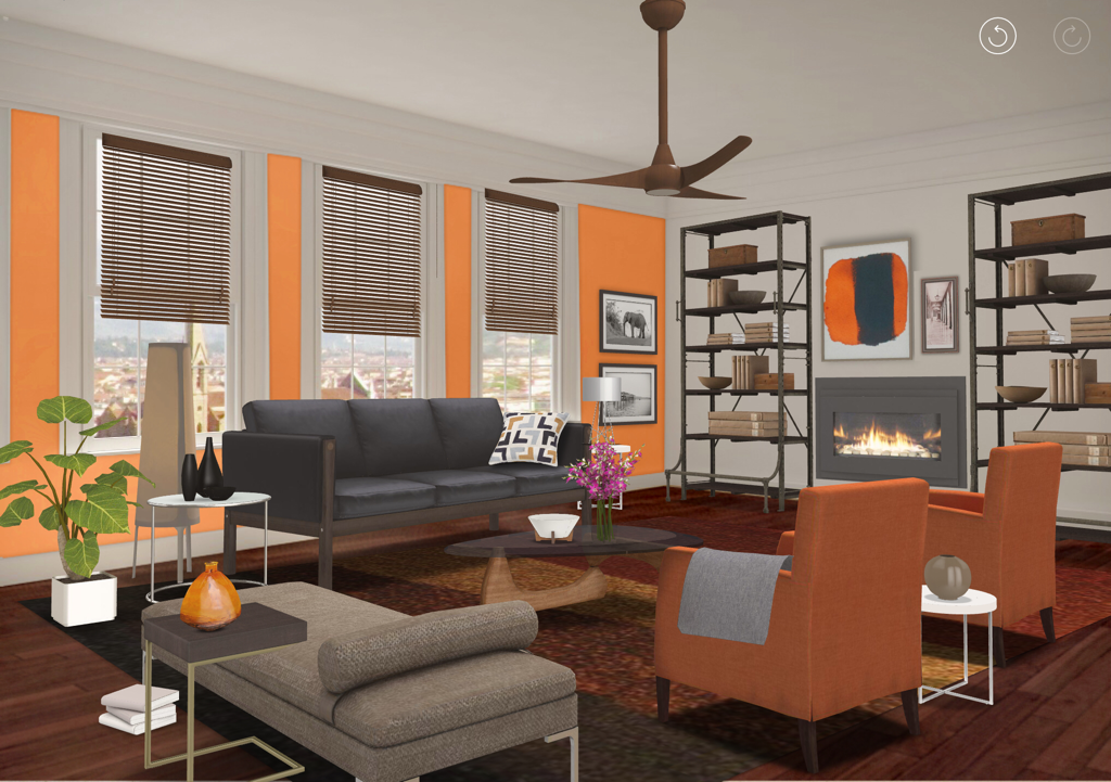
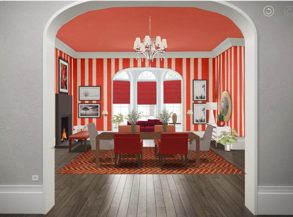
So I hope that gave you some confidence in using colour in a room in an unexpected way and showed you how using different tints, tones and shades of your chosen palette can dramatically change the look and feel of your interiors. Also, feel free to leave comments on things you might like to read about here. And, be sure to like Steve Ryan Designs on Facebook or follow us on Instagram @steveryandesigns. Thanks for reading and striving to live the Well Designed Life Steve Hi Everyone and thanks for checking in with me again. In my last post “Orange Is The New Black” I talked about decorating with orange on the large, medium and small scales (if you haven’t read it go back and read it first because a) it’s genius if I do say so myself and b) this post will make waaaay more sense to you). This time around, I’d like to take what I told you in that post and give you a lesson in decorating with a colour scheme. There are several (Achromatic, Monochromatic, Complimentary, Split Complimentary, Double Compliment ,Primary Triadic, Secondary Triadic, Broken Hue) but I thought I’d start you off easy with *Monochromatic* (using ONE COLOUR). It’s the easiest scheme using colour and, as I’ll show you, you can use a little or a lot of your chosen colour and not screw it up. For this first example I thought I’d do a Monochromatic Colour Scheme using last week’s heavy hitter ORANGE (in case you thought using orange was cray cray). Not only will I decorate a room using orange but I will incorporate the large, medium and small scales that I talked about in last week’s post (which you’ve read by now) so you can see it in action. To all you orange naysayers, behold: Room Design By Steve Ryan Designs - Created Using HOMESTYLER App So here is our good friend Orange used in a contemporary space. You can see I’ve only used orange, neutrals and metallics (Orange is the one colour used hence “Monochromatic” - neutrals are achromatic and metallics don’t really have a hue). You can also see I’ve used it on the large (focal wall colour), medium (armchairs) and small scales (art and accessories). Also, by only painting the window wall I draw your eye to the great view beyond - which I also talked about last week. Sooooo if you live in a condo, apartment or open concept home THIS is the way you should do a Monochromatic Colour Scheme I say (it’s tricky to figure out where to stop and start Colour in an open concept and painting every wall in an open space could overwhelm). This look is very easy to live with and achieve. If you live in a home with *delineated* rooms (clearly walled off and self contained), want to embrace a colour, make a real WOW statement and feel brave because you’re an avid fan of my blog and the wealth of knowledge I impart to you that fills you with confidence, then you might want to try using a Monochromatic Colour Scheme in a BOLD way. Like this: Room Design By Steve Ryan Designs - Created Using HOMESTYLER App
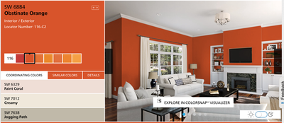
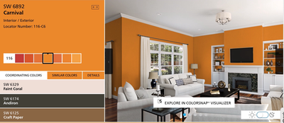
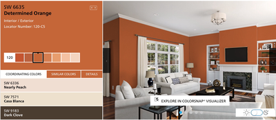
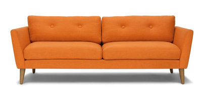
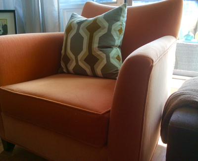
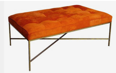
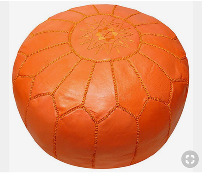
I know. You’re looking at that pic and just sh’t yourself a little. It’s ok. It’s just the WOW factor hitting you. You’ll be fine. Anyway, you can also see here I’ve still used the one hue (with waaaaaay less neutrals) still adhering to the large scale (walls, ceiling), medium scale (chairs, rug, bench, chaise in window, blinds) and small scale (art and accessories). And again I drew your eye to the view using colour as focal point with the red chaise and blinds in the bay window. However, because I’ve used much more large scale colour than the first room, the result is far more dramatic. If you live in an open concept space, you can see this might be hard to live with but because this Dining Room is clearly separate from the house (note the grey walls of the hallway that likely permeates the main spaces) it’s very livable. Also, notice the reds aren’t all the same. When using a Monochromatic Colour Scheme, use tints, tones and shades of that chosen hue to create visual interest. I recommend a Monochromatic Colour Scheme like this for rooms you don’t use very often or are more private spaces such as a Dining Room, Den, Laundry Room or Basement. I especially recommend it for a separate formal Dining Room like this because it’s likely only used occasionally and this look will make those occasions more grand. So my Gentle Readers, I hope this post gives you some confidence in incorporating a colour into your interiors. The best part is, you can use as much or as little as you like so it’s perfect for the colour phobe as much as the colour enthusiast. As long as your space reflects who you are, you really can’t screw it up Thanks for reading and check back with me soon to learn more. Until then, keep striving to live the Well Designed Life Steve Hi Everyone and thanks for checking in with me again. With Fall officially upon us, I thought I’d write this post about decorating with my favourite (and challenging) colour: ORANGE! I know you must think I’m crazy but orange is a great, warm colour that can add coziness or zing to a room depending on its hue. Orange used in a room with a lot of white can energize it while orange used in a room with browns and greys warms up those darker tones. So let’s explore using orange in a room as a wall colour (the biggest impact), large pieces (strong but lesser impact) and accessories (hits of colour). Beginning with wall colour you must first understand that colours can be vibrant or shaded. Vibrant refers to a colour having a “zing” and Shaded refers to it being slightly greyed and more subdued. Each can be effective in creating the mood and feel you want in your rooms. To illustrate this, here’s some help from the good people at Sherwin Williams: You can see in these photos, the room on the left uses a very vibrant orange. This gives real energy and drama to the room balanced with all of the white furniture and actually appears brighter. The middle picture uses a more shaded orange that has a bit more yellow and brown in it (think Butternut Squash). You can see how the room feels cozier and less dramatic (there’s less contrast between the orange and the white) even though the oranges are both very saturated. The picture on the right is a much more shaded orange - more of a cinnamon/nutmeg orange. There’s a lot more brown in it (there is no Brown on the Colour Wheel. It’s a broken hue derived from orange. That’s why browns and oranges work so well together). What is most noticeable in this picture is how calm and cocooning the room feels. Even the white furniture looks more grey-beige than white. Also, at night this room will look even cosier (light is how we see colour - more on that in a future post). Personally this is the type of orange I would recommend if you wanted to experiment with an orange wall. It looks great in many interiors - traditional, transitional, modern, rustic - and would look awesome in a basement, a den/office, entry foyer or as an accent wall in a main space especially if you have a lot of warm whites or walnut to chocolate browns in your floors, trims and furniture. Here you can see using orange on the large scale as a wall colour has your biggest (and least expensive) impact and is also the easiest to change down the road when you want a refresh. Moving on to using orange on a medium scale. This can still provide a powerful punch of pizazz to your space especially if it’s generally neutral (say White/Beige/Grey walls and mid tone walnut floors). People really like neutral spaces as they are very harmonious and calming but adding a furniture piece in a strong colour like orange breaks up the monotony. It’s still calm but there’s more life and visual interest. Plus that item will really be a conversation piece. You can see from these furniture selections how they bring a warmth and energy with them. When mixed in with your neutral space they really draw focus which can be super effective. For example, if you live in a condo with an ugly view, placing that papaya sofa on an opposing wall draws focus to it and away from that unsightly view. If you have a great view, placing it in front of the windows draws your eye to the view and can make your space appear larger: you see the sofa, then the view beyond which makes it feel like that window wall is farther away. Also consider using a bold colour like orange on your balcony furniture. It will also pull your eye to it making your balcony feel like it’s a part of your space, not a separate area. This all works to make a space feel larger and more open. If you’re really Colour Phobic but want to try spicing up your Interior with orange the best way to go is through accessories. These are small pops of colour that come by the way of your pillows, throws, art and objects. In these images you can see how hits of orange in the pillows, throws and art can be used effectively without overpowering the overall look of your Interior because it’s on the small scale. Even something as simple as flowers or a bowl of fruit prove useful. And adding a small appliance like a mixer or espresso machine in a juicy hit of vibrant orange can really add some life to an all white kitchen. Furthermore, placing these hits of the same colour around your room creates a repetitive rhythm that gives your space “movement”. Your eye sees these small hits of colour repeating in your space, your brain recognizes they are a common element, and so you naturally look throughout the space from one pop to the next. It’s an effective way to use colour to create visual interest even if colour makes you nervous or you fear you’ll screw it up.
So if you’re thinking of adding some spice to your Interior life, whether on the grand or not-so-grand scale, I highly recommend you take a cue from Mother Nature and try the Autumnal hues of orange. Be sure to check back with me for my next Design blog post. Thanks for reading and continuing to strive for the Well Designed Life. Steve |








 RSS Feed